There’s also the translation angle 🫠
github.com/w3c/csswg-dr...
06.10.2025 18:27
👍 3
🔁 0
💬 1
📌 0
There are so many people who take the time to really listen and care and do things well.
And then something like CSS carousels comes along and a11y folks end up spending their time and energy on damage control instead of their own a11y spec improvements.
02.10.2025 23:41
👍 6
🔁 0
💬 0
📌 0

A threat model for accessibility on the web - Alice
A explanation of the primary threat to accessibility on the web, and a call to action for the web standards community
I feel this post deep in my bones, Alice gets right to the heart of why working on a11y in standards can feel like killing your soul by degrees.
And also why it’s hard to stop.
alice.boxhall.au/articles/a-t...
02.10.2025 23:41
👍 17
🔁 5
💬 1
📌 0
I’m so glad you liked it! It was such a weird experience going last, because I didn’t really get a chance to talk to other folks there about it.
Also you’d be a good pick yourself, and @sarasoueidan.com
26.09.2025 03:34
👍 2
🔁 0
💬 0
📌 0
It’s also pretty common to just invert the foreground/background tokens for a given control in forced colors.
All of which should provide an accessible approach to state changes, often better than not adding custom color styling.
23.09.2025 00:11
👍 1
🔁 0
💬 0
📌 0
Color changes that meet 3:1 contrast are not considered “color alone” by wcag.
While you can’t know the contrast of user-selected colors, I think it’s fair to assume they were selected because that user can perceive them.
23.09.2025 00:11
👍 1
🔁 0
💬 2
📌 0
To be more explicit, as long as this overrides OS-level user caret styles, this is a terrible idea, and really showcases what spec work looks like when a11y isn’t involved at all.
22.09.2025 22:25
👍 1
🔁 0
💬 0
📌 0
Adrian is wrong about exactly one thing in his post, which is that “when the caret is no longer a stick” is an *excellent* pun.
Added to this: in my experience running user tests with low vision users, customizing the caret is actually pretty common as an accessibility affordance.
22.09.2025 22:25
👍 3
🔁 1
💬 1
📌 0
To be fair, I only considered it because of all the bugs my team gets because of it 😅
It’s one of those fun instances of tension between writing the most accessible UX *now* vs. writing what will remain an accessible UX 😭
22.09.2025 22:18
👍 0
🔁 0
💬 1
📌 0
If it’s a bug then it might! I think the Edge team handles a lot of the forced colors issues, and they’re all lovely (my post isn’t a dig at them personally, these decisions are old).
The issue with backplate is it’s functioning as intended, so there’s nothing to fix from the browser’s POV
19.09.2025 18:24
👍 0
🔁 0
💬 1
📌 0

forced-color-adjust: none is an unavoidable foot gun | Sarah Higley
A very long treatise on why text backplates were a bad idea. Most of the time.
For anyone who pays attention to high contrast / forced colors mode styles:
I wrote up an explanation of why forced-color-adjust: none is nearly unavoidable and how it sets up your codebase for downstream bugs:
sarahmhigley.com/writing/forc...
18.09.2025 20:28
👍 18
🔁 8
💬 2
📌 0
That vase is very cool 😍
18.07.2025 16:21
👍 1
🔁 0
💬 1
📌 0

Unfired clay mug with a light purple to green gradient, dark green thin leaves, and an upside down, belly up black tardigrade that somehow looks like it’s smiling

The same mug, from another angle. The handle is to the right and a side-facing tardigrade reaches toward and grasps one of the dark green plant tendrils

A different more squat mug with a light purple to reddish gradient, light green leaves, and three tardigrades popping down from the rim, out from the handle, and up from the bottom
Carving weird little guys onto mugs to deal with existential angst
04.07.2025 05:52
👍 2
🔁 0
💬 0
📌 0
I don’t currently, but I’d be interested in case I do in the future!
09.05.2025 21:29
👍 2
🔁 0
💬 1
📌 0
This is so much fancier than a brush shoved into a pile of clay, which is where I still am 😅
09.05.2025 19:09
👍 0
🔁 0
💬 1
📌 0
They look great! This makes me want to throw more lidded gaiwans 😊
16.03.2025 20:30
👍 3
🔁 0
💬 0
📌 0

Screenshot of the iPhone confirmation screen to turn off Apple Intelligence in dark mode. After a block of white text telling you what you’ll miss out on, there is a medium gray button with nearly unreadable red text that says Turn Off Apple Intelligence. After that is an easily readable button with white text that says Cancel

Screenshot of a color contrast checker showing a contrast ratio of 1.45 to 1 for the red text against a gray background used in the previous photo’s turn off apple intelligence button
Dark patterns, literally 🤪
17.02.2025 20:14
👍 24
🔁 5
💬 2
📌 0
Literally just picked up the ingredients for it, and the miso-caramel pear pie 😁
26.11.2024 06:21
👍 2
🔁 0
💬 1
📌 0
👋 I work on & write about accessibility in design systems at Microsoft, sometimes with a few of the folks already on the list 😊👉👈
06.11.2024 20:11
👍 1
🔁 0
💬 0
📌 0
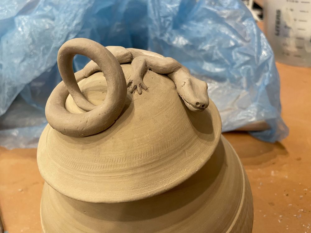
A photo of an unfired clay jar about 8 inches high and 6 around with an abstract texture around the middle and a domed lid. On the lid is a cute little lizard wrapped around the dome, peering forward at you. Its tail curls up into a round handle for the lid.

A top view of the same ceramic jar, looking down at the lizard so you can see how its body is sculpted in more detail. Some blue plastic and paper towels are in the background.
I suppose my inaugural post should be about accessibility or something for bRaNdiNg, but I'm going with this lil guy instead:
21.10.2024 21:10
👍 15
🔁 0
💬 2
📌 0