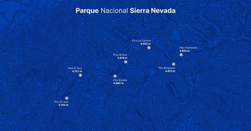
#30DayMapChallenge | Day 24 - Places and Their Names
For today's challenge, I created a map of the highest peaks in Parque Nacional Sierra Nevada in Mérida, Venezuela.
Tools: QGIS and Figma
24.11.2025 16:15
👍 6
🔁 0
💬 0
📌 0

#30DayMapChallenge | Day 21 - Icons
For today's challenge, I used personal data from the routes I run and the cats I greet.
Tools: QGIS + Figma
21.11.2025 23:35
👍 12
🔁 0
💬 0
📌 1

#30DayMapChallenge | Day 20 - Water
For today's challenge, I created a representation of the Mississippi River in the United States using its digital elevation model and light detection and ranging.
Tools: QGIS
20.11.2025 18:56
👍 8
🔁 2
💬 0
📌 0
#30DayMapChallenge | Day 19 - Projections
For today's challenge, I chose to use the “d3.geoAiry” projection for the first time, along with world population data by country.
Tools: D3
19.11.2025 14:43
👍 6
🔁 1
💬 1
📌 0
What I like most about D3 is having complete freedom to do whatever I want based on an idea. Its scales and functions make calculations that can sometimes be complex much simpler.
18.11.2025 15:22
👍 1
🔁 0
💬 0
📌 0

#30DayMapChallenge | Day 18 - Out of this world
For today's challenge, I created a representation of our solar system (somewhat inaccurate).
Tools: D3
18.11.2025 15:22
👍 5
🔁 0
💬 1
📌 0
Using R (and R Studio) for the first time was confusing, but I found it impressive in its simplicity. The lines of code required are significantly fewer compared to D3, which also involves HTML and CSS.
D3: 386
R: 81
17.11.2025 23:13
👍 2
🔁 0
💬 0
📌 0

#30DayMapChallenge | Day 17 - A new tool
For today's challenge, I decided to recreate the map from two days ago that shows active fires in Brazil. This time, I made it a hexbin map using R and ggplot2.
17.11.2025 23:13
👍 7
🔁 0
💬 1
📌 0

Whose Grid Map is better? Quality Metrics for Grid Map Layouts
Grid Map has become quite popular lately. However, multiple publishers had already developed slightly different map layouts. How should one…
I enjoy creating grid maps, especially when I can incorporate additional variables and experiment with filling in the squares. I recommend reading this article that discusses their application and the differences between various publishers' versions: kristw.medium.com/whose-grid-m...
17.11.2025 23:08
👍 1
🔁 0
💬 0
📌 0

#30DayMapChallenge | Day 16 - Cell (Up to Date)
For this challenge, I decided to create a grid map displaying the population of the United States by state.
Tools: D3
17.11.2025 23:08
👍 3
🔁 0
💬 1
📌 0

#30DayMapChallenge | Day 15 - Fire
For today's challenge, I used data from NASA satellites showing active fires and thermal anomalies in Brazil over the past seven days.
Tools: D3
16.11.2025 00:26
👍 20
🔁 2
💬 1
📌 0

#30DayMapChallenge | Day 14 - OpenStreetMap
For today's challenge, I visualized the roads of Barcelona, Spain.
Tools: QGIS
14.11.2025 16:34
👍 5
🔁 0
💬 0
📌 0

#30DayMapChallenge | Day 13 - 10 minute map
For today's challenge, I created a polygon representation of the city of Mérida, Venezuela, including the surrounding mountains.
This is one of the first effects I learned to implement in QGIS, and it took me about 5:42 minutes to complete.
Tools: QGIS
13.11.2025 14:21
👍 4
🔁 0
💬 0
📌 0

#30DayMapChallenge | Day 11 - Minimal map
For today's challenge, I visualized the main streets of Caracas.
Tools: QGIS + Figma
11.11.2025 16:34
👍 6
🔁 0
💬 0
📌 0


Always happy to be able to use D3 and Svelte together
10.11.2025 21:56
👍 1
🔁 0
💬 0
📌 0
#30DayMapChallenge | Day 10 - Air
For today's challenge, I have mapped the most frequent weekly flight routes from Argentina, Chile, Colombia, and Panama.
Tools: D3 and Svelte
10.11.2025 21:56
👍 7
🔁 0
💬 1
📌 0

I was curious to see how it would look in 3D, so I took the opportunity to create it
08.11.2025 20:28
👍 0
🔁 0
💬 0
📌 0

#30DayMapChallenge | Day 8 - Urban
For today's challenge, I decided to create a map showing the population density of municipalities in Spain.
I was surprised to learn that there are two municipalities with only three inhabitants.
Tools: QGIS and Figma
08.11.2025 19:46
👍 7
🔁 0
💬 1
📌 0

#30DayMapChallenge | Day 7 - Accessibility
To complete this week, I visualized the proximity of healthcare services in Italy by analyzing road travel times.
Tools: QGIS and Figma
07.11.2025 23:05
👍 7
🔁 0
💬 0
📌 0


I have to admit, the first few hours using Blender were quite a learning curve!
06.11.2025 01:31
👍 1
🔁 0
💬 0
📌 0


#30DayMapChallenge | Day 5 - Earth
For today's challenge, I transformed a 1963 map from Venezuela's former Ministry of Public Works by incorporating the corresponding elevation and terrain data.
Tools: QGIS and Blender
06.11.2025 01:31
👍 7
🔁 0
💬 1
📌 0


#30DayMapChallenge | Day 4 - My data
For today's challenge, I analyzed data from my running activities (14 months)
• Activities: 168
• Total hours: 196,9
• Total distance: 1.717,27 kilometers
• Average per day: 10,47 kilometers
Tools: Strava, Svelte and MapLibre GL JS + CARTO
05.11.2025 03:43
👍 8
🔁 0
💬 0
📌 0
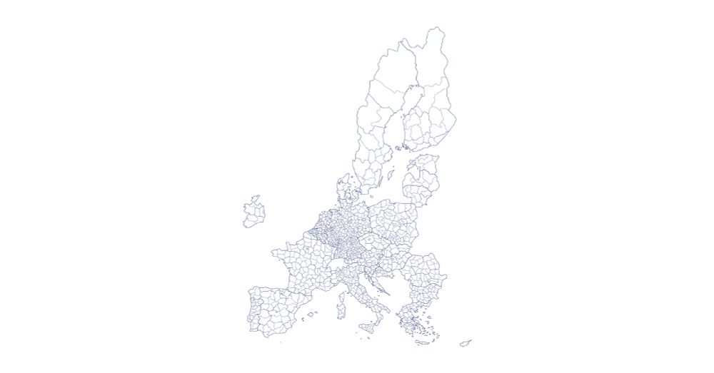

#30DayMapChallenge | Day 3 - Polygons (up to date)
For this challenge, I chose to illustrate the borders of the countries in the European Union.
Tools: D3
05.11.2025 03:37
👍 2
🔁 0
💬 0
📌 0

#30DayMapChallenge | Day 2 - Lines (up to date)
For the second challenge, I mapped the rivers and waterways in North America.
Tools: QGIS and D3
05.11.2025 03:30
👍 5
🔁 0
💬 0
📌 0

#30DayMapChallenge | Day 1 - Points (Up to Date)
For the first challenge, I represented the geographical distribution of over 15,000 Starbucks locations in the United States.
Tools: D3
05.11.2025 03:25
👍 2
🔁 0
💬 0
📌 0
My main goals are clear:
• To improve my skills with D3 and Svelte.
• To explore using QGIS and Blender.
• To learn and enjoy the process.
By the weekend, I plan to upload the open-source code and create a website where you can view and interact with the maps in high quality
05.11.2025 03:17
👍 1
🔁 0
💬 0
📌 0
I'm excited to participate in the #30DayMapChallenge for the first time! The challenge started a few days ago, and due to my limited time and my experiments with Blender, I haven't had the chance to publish my maps yet. While I'm not sure if I'll be able to create all 30 maps...
05.11.2025 03:17
👍 0
🔁 0
💬 1
📌 0
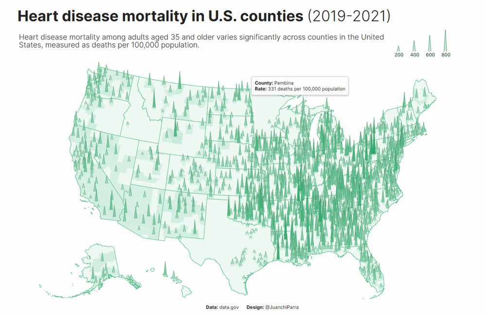
#30DayChartChallenge | Day 30 - National Geographic
For this last challenge, I moved away from the main idea and the prompt, but I liked the result. Very happy to have done all the challenges.
For those who want to see the source code: github.com/juanchiparra...
01.05.2025 02:32
👍 11
🔁 1
💬 0
📌 0