

New Year, New Colour Tool
for you data visualizers and maybe the odd designer
obumbratta.com/colour
07.01.2026 16:20
👍 258
🔁 62
💬 6
📌 12
New Year, New Colour Tool
for you data visualizers and maybe the odd designer
obumbratta.com/colour

Build the thing you wish to see in the world
A blog post about building things because you want to, learning about #ATProto, and some recently influential conversations I've had on the @overcommitted.dev with @bradhe.net @turoczy.bsky.social and @ngerakines.me
brittanyellich.com/build-the-th...

📊 The November 21 meetup is LIVE! We'll learn about Łukasz and Mateusz's lessons and experiences from building interactive diagrams for industry using open source libraries. Hosted at @datadoghq.com HQ in NYC.
RSVP here: www.meetup.com/datavisualiz...

📊 🧶 When was the last time you learned of a new chart? Do you know when to use parallel coordinates, hammock, or Sankey plots?
Join #dataviz fans & Professor/author Matthias Schonlau in NYC for the May 19 meetup on mixed categorical/numeric data @datadoghq.com! RSVP: www.meetup.com/datavisualiz...

The video of Ben's talk is now available! www.youtube.com/watch?v=P4TS...
QotD: "For the same reason it wouldn’t make sense to ask a robot to lift weights for you at the gym, it doesn’t make sense to ask an agent to “learn” papers for you."

Elizabeth Goodspeed on why graphic designers can’t stop joking about hating their jobs > buff.ly/X4jyklg

NYC's hidden parks and public spaces? There's an app for that! The NYC Public Space app by @chriswhong.bsky.social shows nearly 2,800 public spaces in NYC. bit.ly/4hy6CjL @gothamist.com

Single-sided violin plot with strip plot below and a simplified box plot between the two.
I like single-sided violin plots. It's nice to use a tool that can actually make them. #Vega
this is exactly the kind of content I've missed, a good old nerdy roll-your-own #dataviz/#carto algorithm. also emphasizes how deep domain/topic knowledge is so important in making a good viz 🙌
Several attendees (including me) noted this talk made them curious to interview relatives about their own family history. It was a good reminder that if you want decades of personal data l “Querying data” starts with talking to people, not writing SQL!

scatterplot of dots over time with total downloads on the y axis
A sign that accessibility and data viz is important: the most downloaded episode of the Data Stories Podcast ( @moritzstefaner.bsky.social @ebertini.bsky.social ) is the episode about accessibility with the amazing @fossheim.bsky.social
Check out the data: observablehq.com/@moritzstefa...

Presenting the first new feature I added to my website with my voice, and why it matters.
whitep4nth3r.com/blog/how-to-...
I look forward to learning about wrangling and visualizing historical networks with @bengarvey.com of the Philadelphia #dataviz meetup. See you there! 👨👨👧👦🌳
The entire archive of CDC datasets can be found here.
HUGE shoutout to data archivists- this work is important 👏🙌🏻
archive.org/details/2025...
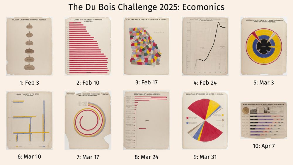
10 selected images from the 1900 Paris Expo from Du Bois. 1) Value of Land Owned by Georgia Negroes (plate 18) 2) Acres of Land Owned by Negroes in Georgia (plate 19) 3) Land Owned by Negroes in Georgia, USA, 1870-1900 4) Valuation of Town and City Property Owned by Georgia Negroes (plate 21), February 24 5) Assessed Valuation of all Taxable Property Owned by Georgia Negroes (plate 22), 6) Negro Property in Two Cities of Georgia 7) Assessed Value of Household and Kitchen Furniture Owned by Georgia Negroes 8) Occupations Of Georgia Negroes (plate 26), 9) Occupations Of Negroes And Whites In Georgia 10) Income and Expenditure
Tomorrow, the #DuboisChallenge2025 kicks off, where over 10 weeks, we encourage people to re-create 10 visuals created by Du Bois for the 1900 Paris Exposition. The theme for this year is: Economics. See: github.com/ajstarks/dub...
10 images for the Du Bois Challenge 2025
This year the #DuboisChallenge will come to BlueSky, with the theme "Economics": #DuboisChallenge2025

It's not well known, but it's so useful: you can have excalidraw data embedded directly in PNG so you don't need separate JSON and PNG from exports whe in VSCode. This way Github previews the file in browser, and it's still editable. See @pomdtr.me 's PR github.com/excalidraw/e... for more info
A goldmine for vacation technical reading has just been published! An update to the one from 2020 to include 2020 - 2024 hot picks, there is so much great stuff in there I kept getting distracted building it :p
observablehq.com/@tomlarkwort...

I liked this collection + the prompt to watch for more “primary sources”, thanks for starting this.
I’ll nominate @natbat.bsky.social‘s writeup on Lanyrd, covering the story from the spark to YC to exit (plus details on collabing with @simonwillison.net ). blog.natbat.net/post/6165840...

Screenshot of the method and topic lesson filters on the English vesion of The programming Historian DH tutorial journal, covering options including data scarping and analysis, visualization, mapping, APIs, Python, linked open data, digital publishing, and more
Programming Historian is an amazing resource w/100+ lessons (in English version) covering code, data, map methods; labeled difficulty levels; written, peer-reviewed, edited by humanities scholars to accessibily walk you through new ways to approach your research: programminghistorian.org/en/lessons/

A small infographic showing a variable-width bar chart. The title is 'the digital divide' and the chart shows in which countries men have better access to the internet, and in which countries women have better access. Everything in this visual related to men has been colored in purple, everything related to women in orange.
🎨 Consistency: possibly the most important consideration when using color in a data visual or dashboard.
The role of color is not (only) to make your visual look good, but mainly functional: to provide emphasis and structure, to draw the attention or distinguish categories.
(1/4)
I’m reflecting on how games promote intuition even outside the gameframe, and encourage safe and curiosity-driven risk-taking (a cornerstone of experimentation) after learning of Jeanette Wing’s paper at #NYCsoData #opendataweek www.cs.cmu.edu/~15110-s13/W...
I contributed to this list of games for computational thinking organized by @warianoguerra . It is fun to see the many ways to play with the concepts of computers, without being in a code editor!
HOW TO GET STARTED ON DATAVIZ BLUESKY 📊 IN 9 STEPS
If you're arriving here, you may wonder where is the dataviz community and how to partake in it.
Here's a thread on how I suggest going about it.
🧵👇
My go-to resource for sports psychology research when I competed in (age group) swimming was Brent Rushall’s coaching science abstracts ( coachsci.sdsu.edu/rushall/inde... ) . He‘s advised teams from the youths up to the Olympic level, I found his observations helpful.