Screenshot of the OVA website, showing all courses
The Open Visualization Academy (OVA) IS LIVE!
openvisualizationacademy.org
Thread follows #dataViz #infographics #dataJournalism #dataVisualization
30.01.2026 15:09
👍 232
🔁 107
💬 8
📌 24
It was created in After Effects using distortion effects.
03.01.2026 09:02
👍 2
🔁 0
💬 1
📌 0

A preview of four articles from Nexo Jornal, including data visualization. These snippets are from a portfolio published by Nexo Jornal featuring all of their visual work from 2025.

A compilation of the most clicked maps on maps.com. Shown is a selection of three, including a map about the aurora and one about shipwrecks. Published by maps.com.

This is a compilation of charts published by McKinsey & Company, each explaining an important topic related to the year 2025, such as electric vehicles or the usage of AI.

Three visualizations that won or received an honorable mention in the 2025 Swiss Viz Award. The topics they cover include women in labor and biodiversity. Published by Swiss Viz.
Happy New Year! 🎉 While the Data Vis Dispatch is still on holiday break, we’ve rounded up the best-of-2025 lists celebrating data journalism, visualizations, and the people behind them. See something we missed? Send it our way, and we’ll happily include it!
www.datawrapper.de/blog/data-vi...
30.12.2025 14:26
👍 17
🔁 6
💬 4
📌 1
Defense Against Dishonest Charts
This is a guide to protect ourselves and to preserve what is good about turning data into visual things.
Dishonest charts are coming from all directions, and they're only going to hit harder. Unless we push back. So, an interactive guide: Defense Against Dishonest Charts flowingdata.com/projects/dis...
13.02.2025 21:44
👍 504
🔁 250
💬 32
📌 58

Feature image, a giant 2024 in a handwriting font in the foreground, three visualizations, one of which is The Pudding Cup in the background.
The glasses are clinking, the countdown is running, but you’re still thinking about data visualizations? We got you covered with our list of lists of 2024 data vis.
Check out personal favorites, portfolios, and award-winning vis from 2024 blog.datawrapper.de/data-vis-dispatch-december-31-2024/
31.12.2024 17:00
👍 20
🔁 11
💬 0
📌 0
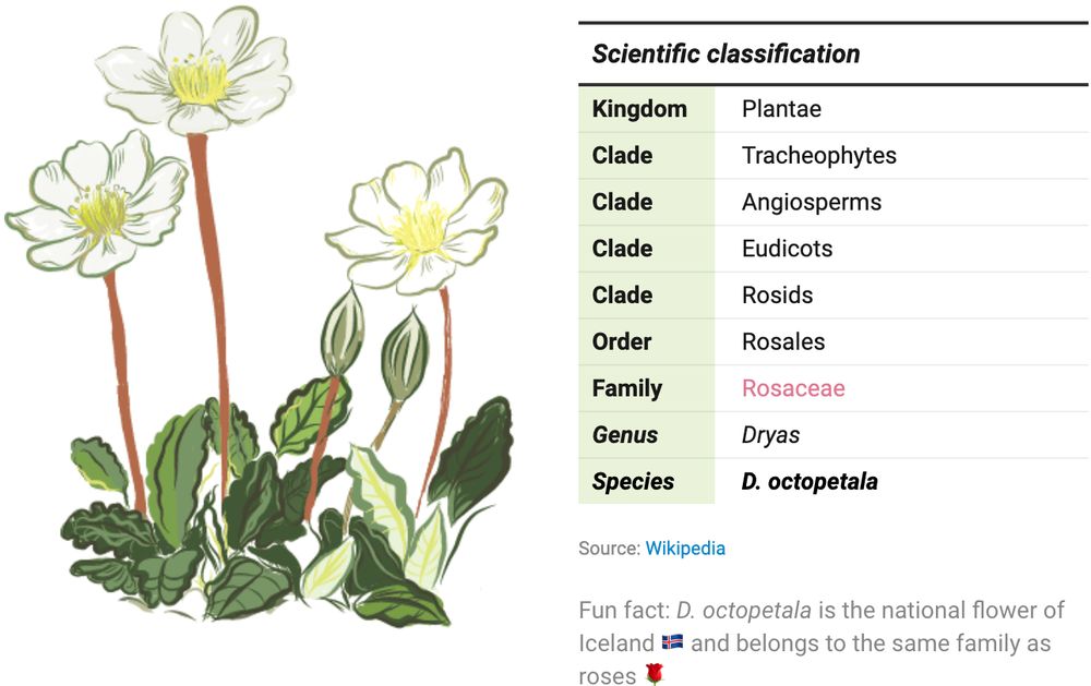
Table of the scientific classification of the flower Dryas octopetala annotated with a handmade illustration. Created by Eleni from the Datawrapper team.

Screenshot of I “Made a Graph of Wikipedia... This Is What I Found”. Shown is a network graph of all Wikipedia articles and the links between them, resulting in a colourful representation of the world's collective knowledge. Among the most interesting findings are so-called communities, groups of articles that are more closely linked to each other than the rest of the site, represented by the individual colours. Published on YouTube by adumb.
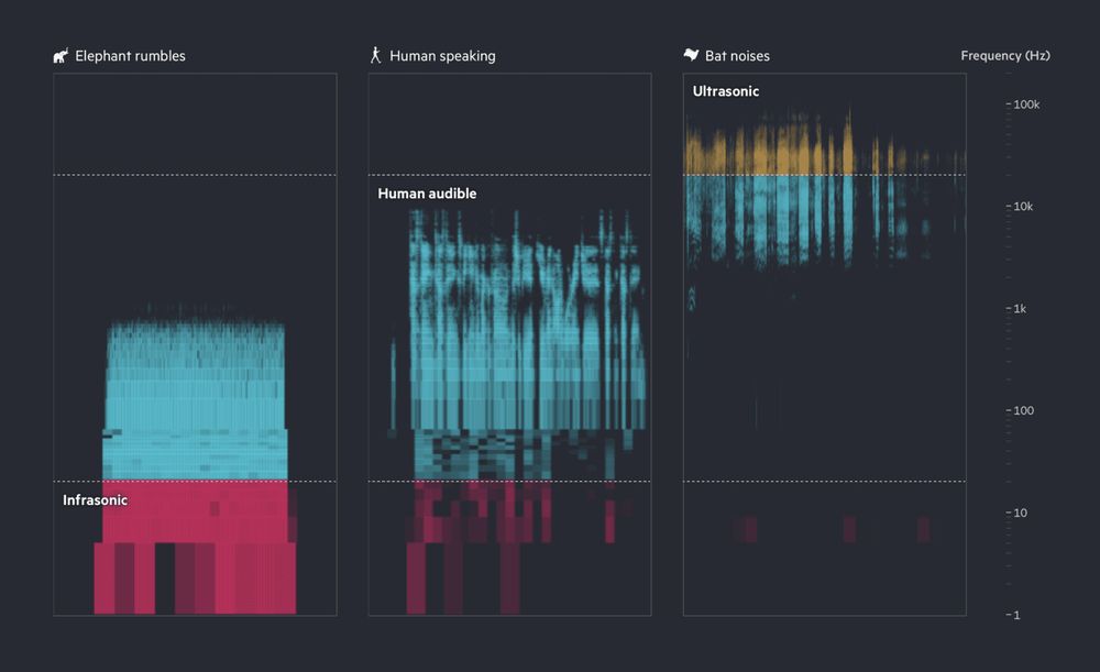
This image shows a spectrogram of three sound types: elephant rumbles (mostly infrasonic, red), human speaking (audible range, blue), and bat noises (ultrasonic, yellow and blue), with frequency increasing from bottom to top on a logarithmic scale. Published by Financial Times.
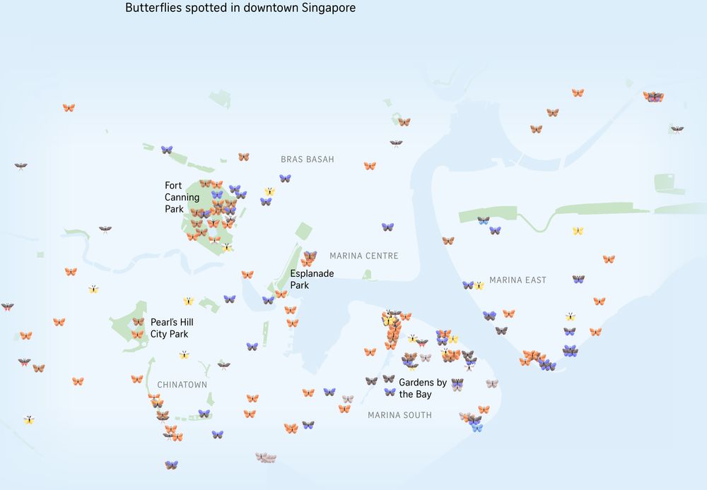
Map of downtown Singapore with little 3D butterflies added where butterflies have been spotted in the area. Different colored butterflies represent different species. Published in The Straits Times.
End of the year! ✨🎄🎇 So here we've got a special Data Vis Dispatch for you: it comes from the whole Datawrapper team. We're sharing our favorite visualizations of 2024. Take a look here 🎁 https://blog.datawrapper.de/data-vis-dispatch-december-17-2024/ and tell us: what were your favorites?
17.12.2024 16:33
👍 71
🔁 26
💬 2
📌 6
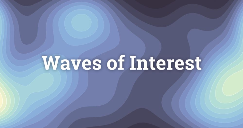
Waves of Interest
Tracing Google Search Interest in US Election Years
Excited to launch a new project today!
🌊 Waves of Interest 🔍
We investigate how the search interest in political topics shifts across US election cycles, using Google Trends Data.
waves-of-interest.truth-and-beauty.net
26.09.2024 12:27
👍 41
🔁 13
💬 4
📌 3
If you consider yourself an established data viz practitioner, please please please consider applying!
Especially #D3js people! There are always way more mentees looking for d3 support in this program than there are mentors who could help.
03.09.2024 17:26
👍 4
🔁 2
💬 0
📌 0
Continue playing with the #visualization of #russian personnel and equipment losses data. This time animated multi-line chart 📊 using #svelte #d3.
Interactive svelte component: svelte.dev/repl/2c3185b...
#dataviz #datavis #warinUkraine #RussiaIsATerroristState
16.09.2024 17:55
👍 3
🔁 1
💬 0
📌 0

Thank you!
There is the same data visualized as a treemap. Here is a link to the notebook: observablehq.com/@romansverda...
14.09.2024 16:11
👍 0
🔁 0
💬 0
📌 0

Yes, y're right. Thanks a lot for pointing it out!
I forgot to exclude outliers from the legend color scale. There are two values, 2000 and 3160 of the personnel losses from the first weeks of the war, and the same for the APV category. Fixed it and added a spreadsheet view to the daily data.
14.09.2024 16:02
👍 0
🔁 0
💬 1
📌 0

russian artillery losses in Ukraine since Feb 24, 2022

russian personnel losses in Ukraine since Feb 24, 2022
A weekly update on daily russian personnel and equipment losses in Ukraine are already available on my "calendar" charts. Not sure about the name of the chart, but the calendar seems like a good option.
Interactive #observable notebook:
observablehq.com/@romansverdan/ru-losses-in-ukraine
#dataviz
14.09.2024 12:09
👍 5
🔁 0
💬 1
📌 1


I often use #Svelte #Scroller in #dataviz projects, and only recently discovered that it supports custom queries as a prop, and can work with any kind of HTML tags in the foreground, not just sections as it is by default. It's time to say goodbye to ugly, non-semantic "Untitled Section"
11.09.2024 19:57
👍 0
🔁 0
💬 0
📌 0
Perfect topic for my first ever post on #bsky.
I'm #dataviz developer at The Straits Times ( #Svelte, #Vue, #D3, #Three.js, #Threlte & many more). Information design lecturer at the Lviv Arts Academy (Ukraine).
Participated in many dataviz events and observed 17 elections in 11 countries
07.09.2024 19:21
👍 7
🔁 1
💬 0
📌 0