Fresh out of the oven, sweet-and-savory king cake fresh, braided and flecked with the green of scallions
Help yourself to a slice of scallion king cake to celebrate combo Lunar New Year and Mardi Gras. 🧧🎭 It’s not too sweet! #GongHeiFatTuesday
18.02.2026 04:33
👍 1
🔁 0
💬 0
📌 0

Code and output preparing a table of word counts for documents in a corpus, with document titles depicted in italics.
Code:
corpus_joyce |>
tabulize()
italicize_titles()
Output shows a table with three rows and two columns, with the first column for title and the second for word count. Dubliners is shown with 67,945 words, A Portrait of the Artist as a Young Man is shown with 84,926 words, and Ulysses is shown as having 264,975 words.

Code and output preparing a bar chart of word counts for documents in a corpus, with document titles depicted in italics.
Code:
corpus_joyce |>
visualize()
italicize_titles()
Output shows a figure with three horizontal bars. On the Y-axis are three book titles: Dubliners, A Portrait of the Artist as a Young Man, and Ulysses. Bar lengths noticeably increase, with the bar for Ulysses shown as more than three times the length of the bar for A Portrait of the Artist.
I’m also very pleased with the elegant interface for functions like `italicize_titles()`, which works with both tables and figures. Check out more in the getting started page: jmclawson.github.io/tmtyro/artic... #RStats
06.01.2026 16:59
👍 2
🔁 0
💬 0
📌 0

R code and output, showing the creation of a methods narrative from a log that was created behind the scenes.
R code:
bigrams_joyce |>
narrativize(format = "text", person = "we", return = "html")
Output:
First we retrieved a corpus from Project Gutenberg using ID numbers 2814, 4217, and 4300. Then we moved column `subsection` into body text. Next, we loaded texts by tokenizing words, converting to lowercase, and preserving paragraph breaks. We identified documents using the column `title`. Finally, we constructed bigram sequences from the text.

Screenshot of RStudio’s data viewer, with tidytext-style data showing one word per row and descriptive labels under key variable names. The example data shows James Joyce’s story “The Sisters.”
The columns `doc_id` and `word` are unlabeled.
`new_word` is labeled “new use of word.”
`hapax_doc` is labeled “document singleton.”
`hapax_corpus` is labeled “corpus singleton.”
`vocabulary` is labeled “count of new words.”
`ttr` is labeled “text-token ratio.”
Super excited to share the 0.6 update to my R package for text mining. Designed for students new to #RStats (and text mining), it’s nevertheless what I use in my own work. This update packs in a ton, but my favorite new features are methods logging and labels.
jmclawson.github.io/tmtyro/news/...
06.01.2026 16:45
👍 13
🔁 4
💬 1
📌 0
Nodes
I also made a pretty basic Shiny app for loading, manipulating, measuring, and visualizing network data. It’s a little like Gephi Lite in the browser. Here’s the link: jmclawson.shinyapps.io/data_network...
30.10.2025 15:34
👍 0
🔁 0
💬 0
📌 0
The later links on that page still work, if you’re ok focusing on just one movie. Here’s Episode IV for instance: evelinag.com/data/2015/st...
30.10.2025 15:31
👍 0
🔁 0
💬 2
📌 0

Map focused on Lakeview neighborhood in Chicago. Three red circles show the locations of Red Line trains heading to Belmont station.

Map focused on the downtown loop in Chicago. Multiple circles show the locations of Blue, Pink, Brown, Green, and Orange Line trains heading to the station at Clark and Lake.
Choo choo! An update with mapping adds current locations of trains heading to the station. 🚊 (Leaflet is *amazing* and Stamen's Toner maps look so good on device!)
17.10.2025 16:54
👍 1
🔁 0
💬 0
📌 0
🙇 Thanks!
08.10.2025 20:36
👍 0
🔁 0
💬 0
📌 0
Amazon.com
Of course! It’s this 5” screen from Hosyond: a.co/d/3uuHsbS
08.10.2025 14:24
👍 1
🔁 0
💬 1
📌 0

Small display beside a speaker. On the display are colored rows of purple, red, and brown, with destinations and estimated times of arrival into Belmont station—listed at the bottom beside a toggle with an arrow pointing down.
Building a #Shiny app with #RStats to track real-time train arrivals at my local station was satisfying and did the job I wanted.
But getting a small touchscreen to have it all run locally on an unused #RaspberryPi makes it *unspeakably* enjoyable.
I made a useful toy!
08.10.2025 13:32
👍 23
🔁 1
💬 4
📌 0

Scatter plot showing three clusters: travel writing at the far right, commercial fiction at the bottom left, and literary fiction at the top center. A few texts appear as outliers, positioned closer to other clusters.
🚨 New publication alert! My latest blog post shares findings from my work on Lawrence Durrell’s style—plus a correction or two 🙈
#DigitalHumanities
jmclawson.net/posts/2025-0...
24.09.2025 20:15
👍 1
🔁 0
💬 0
📌 0
intro – great_tables
Python has the Great Tables package with similar syntax to R’s gt package: posit-dev.github.io/great-tables...
For both, you can add column-spanning values (like “equation form vs…” in the image) using `tab_spanner()`
26.08.2025 16:05
👍 2
🔁 0
💬 0
📌 0
Additionally, continue to plan regular video dates, whatever that means for you:
Cook together or order favorites to eat together… Watch TV shows (either with video chat on silent or checking back in after the episode)… Share a crafting hobby like Legos or knitting or painting.
07.08.2025 19:49
👍 1
🔁 0
💬 0
📌 0
Seconded on the video calls. Makes all the difference to see each other regularly (and it’s a better audio quality than phone calls).
07.08.2025 19:46
👍 1
🔁 0
💬 1
📌 0
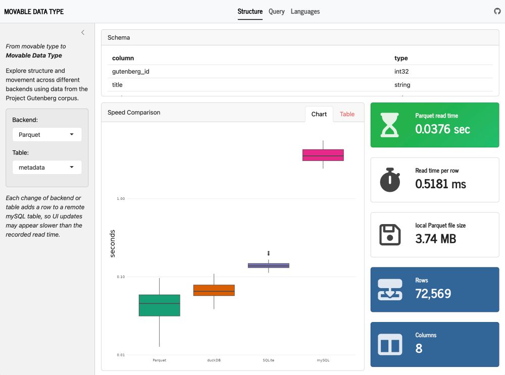
Screenshot of Shiny app comparing structure and performance of one data set using Parquet files, duckDB, SQLite, and MySQL. The “Structure” page is selected, and additional pages labeled “Query” and “Languages” are also listed
From shower idea to #Shiny app in 2 days. 😅 Little late for last week’s #TidyTuesday but I couldn’t stop adjusting! Movable Data Type explores Gutenberg data across backends, comparing structure, running queries, and visualizing distributions. #RStats #SQL jmclawson.shinyapps.io/movable-data...
11.06.2025 16:50
👍 19
🔁 3
💬 1
📌 0
Someone’s been visited by the Easter Punny!
20.04.2025 17:14
👍 1
🔁 0
💬 1
📌 0
Enchanting in-browser tutorials – jmclawson.net
The Zen of CSS Design was published 20 years ago next week, and I still own my copy.
To mark the occasion, I performed a little CSS magic: modern pseudo-classes add progressive reveal in a WebR learnr tutorial.
🔗 jmclawson.net/posts/quarto...
My zen gardens now grow #RStats, but CSS is perennial.
20.02.2025 03:26
👍 2
🔁 2
💬 0
📌 0
One guard always tells a lie, and the other guard never tells the truth.
11.02.2025 17:23
👍 3
🔁 0
💬 0
📌 0

Bar charts comparing NRC sentiment distributions for Bluesky posts discussing Python and RStats. In Python posts, the sentiments fear, trust, and anticipation show the highest scores of about 1.25%. Among RStats posts, the sentiments trust, anticipation, and joy score the highest, at about 2%, 1.7%, and 1.1%.
Proof that I sometimes emerge from the shadows of social media: a blog post about using Python and R to analyze Bluesky posts... about Python and R. Truly, the ouroboros of sentiment analysis. 🐍📊 #Python #RStats jmclawson.net/posts/bluesk...
18.01.2025 18:34
👍 33
🔁 4
💬 0
📌 1
@weatherfrontman.bsky.social Weather in Chicago, IL
11.12.2024 15:51
👍 0
🔁 0
💬 0
📌 0
@weatherfrontman.bsky.social wx in Toronto, Ontario
11.12.2024 15:31
👍 0
🔁 0
💬 2
📌 0
Apologies for what must seem like weird post spam. I’m troubleshooting a bot 🤖 and assumed Bluesky would follow Twitter behaviors for hiding away posts beginning with a mention. 🙃
11.12.2024 15:24
👍 0
🔁 0
💬 0
📌 0
@weatherfrontman.bsky.social testing!
22.11.2024 01:16
👍 0
🔁 0
💬 3
📌 0