

Life satisfaction mostly declines with age. Previous findings (esp. the famous U-shaped age-SWB trajectory) were artifacts of misspecified models. doi.org/10.1093/esr/...
29.09.2025 12:14
👍 164
🔁 51
💬 10
📌 42
Life satisfaction mostly declines with age. Previous findings (esp. the famous U-shaped age-SWB trajectory) were artifacts of misspecified models. doi.org/10.1093/esr/...
Like this! sessioninfo::session_info() can now (or will after review) output to LaTeX #rstats github.com/r-lib/sessio...

Extending ideas originally proposed by Charles Manski in 1988 and considering quantile-welfare evaluations of health policy as an alternative to utilitarian evaluation, from Charles F. Manski and @johnmullahy.bsky.social https://www.nber.org/papers/w34247

A new paper I worked on is out in Justice Quarterly! I won't speak on the substantive nature of the paper as I worked solely as the methodologist, but I developed a new matching method not otherwise described in the literature, and I want to tell you about it!
#statssky #casualsky

For the open source devotees out there, I've integrated @OpenFreeMapOrg into the #rstats {mapgl} package.
Do `maplibre(style = openfreemap_style("liberty"))` for an excellent street map with 3D buildings; "bright" & "positron" are also available.
Map with no API keys required!
The new {marginaleffects} release for #RStats (0.30.0) comes with two new vignettes:
1. Speed up computation with automatic differentiation (often 10x gains) marginaleffects.com/bonus/perfor...
2. Power analyses with {marginaleffects} and {DeclareDesign}. marginaleffects.com/bonus/power....

I am beyond excited to announce that ggplot2 4.0.0 has just landed on CRAN.
It's not every day we have a new major #ggplot2 release but it is a fitting 18 year birthday present for the package.
Get an overview of the release in this blog post and be on the lookout for more in-depth posts #rstats
New The Effect materials today: introductions to basic coding and data manipulation in R, Stata, and Python. Get the wheels turning on using these languages with data with these intro pages and exercises:
nickchk.com/Coding%20and...
nickchk.com/Coding%20and...
nickchk.com/Coding%20and...
My paper on designing and analyzing powerful experiments is now up online at Fiscal Studies. Here is my shareable link for free access: onlinelibrary.wiley.com/share/author...

📢 R Dev Day @ Australia
🏢 Monash University, Melbourne
🌐 Remote, Australia
📅 Fri 21 Nov
It's happening!
Apply to attend this free event, to collaborate on contributions to #RStats! You don't need to be an R guru!
Deadline Sunday 16 Nov: pretix.eu/r-contributo...
#RDevDay #RSEng
Running R code on your phone... that is definitely magic!!
webR also makes it super easy to create #rstats learning resources that students can work with using just a browser, no install drama needed.
jen-richmond.quarto.pub/barbarplots/
Didn't they get the memo that some of us use Windows for work, not to roleplay Tron?


Grad programs often don't teach folks how to write good reviewer reports. Here are some resources:
1. @brendannyhan.bsky.social review checklist: thepoliticalmethodologist.files.wordpress.com/2016/02/tpm_...
2. "How to Write an Effective Referee Report": aeaweb.org/articles?id=...
What else?

Source: "Producing Health: Measuring Value Added of Nursing Homes"
Forthcoming, Econometrica
dropbox.com/scl/fi/3nw2j...

All good things come in pairs. Or threes?
My 3rd paper using football data. This time a labor question.
draft! Comments welcome
papers.ssrn.com/sol3/papers....
Lol I love this hot take. On point.
Highly relevant to anybody working with regression discontinuity designs
Georgia Papadogeorgou, Zhaoyan Song, Guido Imbens, Fabrizia Mealli: Causal Inference when Intervention Units and Outcome Units Differ https://arxiv.org/abs/2507.20231 https://arxiv.org/pdf/2507.20231 https://arxiv.org/html/2507.20231
How insane is it that openai asks for BIOMETRIC information for using its API with the o3 model?! Asking me to take a selfie and upload personal documents. Anthropic, here I come #dataskyence
Yes please!
Something you might find helpful is ggview::canvas() for setting the in RStudio viewing pane to be in the proportions you intend to export in. So it should look the same as a saved figure.
A little while ago I saw a really beautiful colour palette/colour science post. It was something to do with capturing pastel/water colours and transformations to the colourspace. I can't for the life of me remember what is was called, does anyone remember this? #rstats
Revising my survey and experiments grad course and looking for examples of papers that do a good job of (really) integrating observational and experimental data. Suggestions? Self-reference welcome.
Very very interesting and looking forward to reading it in full
These course notes on nonparametric regression (including kernel density estimation) by Eduardo García Portugués are *fantastic*. So clear, with great visuals and clear code.
This goes in the right direction but I guess I'm wondering what is the best practice for implement something like this in latex
I'm talking about several things at once. The mechanical way of placing figures is maybe easier to figure out. But how to do it in a way that is aesthetically pleasing, like a professional magazine editor would it, is less easy. It's an overlooked aspect of data viz
#rstats and TeX friends: what are your best takes on how to nicely size and place figures in academic articles? I spend time curating my #dataviz but then I default to big page-wide plots that end up automatically at the bottom of the document. Any tips/resources?
#latex
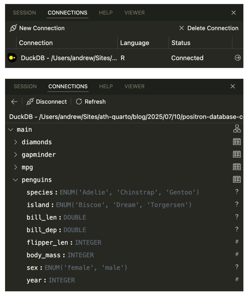
Screenshot of a connection to a DuckDB database, and a screenshot of the columns of one of the tables in that database
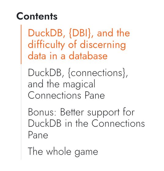
Table of contents for the post: - DuckDB, {DBI}, and the difficulty of discerning data in a database - DuckDB, {connections}, and the magical Connections Pane - Bonus: Better support for DuckDB in the Connections Pane - The whole game
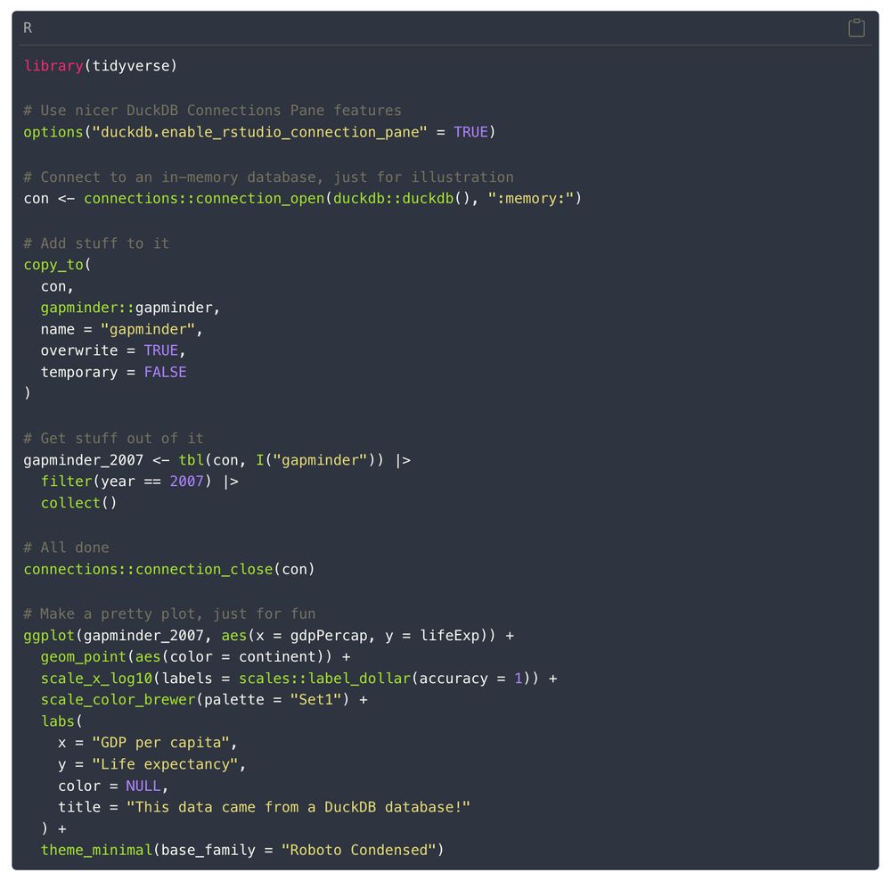
R code for connecting to a database, adding stuff to it, extracting it, and plotting it library(tidyverse) # Use nicer DuckDB Connections Pane features options("duckdb.enable_rstudio_connection_pane" = TRUE) # Connect to an in-memory database, just for illustration con <- connections::connection_open(duckdb::duckdb(), ":memory:") # Add stuff to it copy_to( con, gapminder::gapminder, name = "gapminder", overwrite = TRUE, temporary = FALSE ) # Get stuff out of it gapminder_2007 <- tbl(con, I("gapminder")) |> filter(year == 2007) |> collect() # All done connections::connection_close(con) # Make a pretty plot, just for fun ggplot(gapminder_2007, aes(x = gdpPercap, y = lifeExp)) + geom_point(aes(color = continent)) + scale_x_log10(labels = scales::label_dollar(accuracy = 1)) + scale_color_brewer(palette = "Set1") + labs( x = "GDP per capita", y = "Life expectancy", color = NULL, title = "This data came from a DuckDB database!" ) + theme_minimal(base_family = "Roboto Condensed")
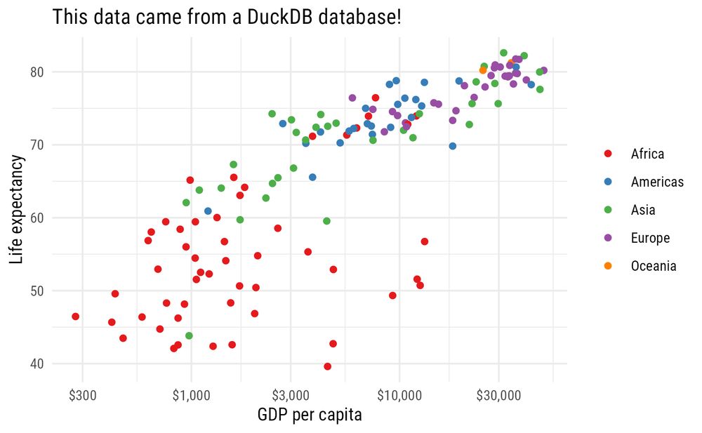
Scatterplot showing global health and wealth from gapminder in 2007
Another @posit.co Positron blog post! To make it easier to work with some huge data in one of my projects, I've loaded it into @duckdb.org. The Connections Pane makes it really easy and convenient to connect to and explore databases with #rstats. Here's how: www.andrewheiss.com/blog/2025/07...