

新宿 / Shinjuku
03.03.2026 16:23
👍 48
🔁 12
💬 0
📌 0
新宿 / Shinjuku

Communication Center
Painting study
It also has a whole level set in a Hollywood studio, where we can fight zombies in various movie sets. Feels like the devs had fun.
Tbh, I kept wondering what kind of black magic the devs used to make the game look this good while still running butter smooth.

Also apparently it runs on UE4, which was surprising. The lighting feels very close to Lumen, I totally assumed it was a UE5 game.


I’ve been playing Dead Island 2, and the atmosphere is really great. It offers a surprisingly wide variety of locations and moods.
It is a very static scene (cars and vehicles don’t move for exampl) but I could record a video of flying around it when it is ready for sure.

Another shot from my Mirror’s Edge-inspired scene.
I’ve updated the lighting and post-process to bring back a cooler blue tone while still maintaining the impression of bright sunlight.

上野 / Ueno
Another shot from my Mirror’s Edge-inspired scene.
I’ve updated the lighting and post-process to bring back a cooler blue tone while still maintaining the impression of bright sunlight.

A screenshot from Vampire The Masquerade Bloodlines with two drink vending machines. The one on the left is yellow and features a massive number "13", drink selection buttons labeled, in order: "Thirteen", "Yello Sno", "SEXXX", "Triple Team" and "Dirty SancheZ". The one on the right is purple and has an upside down pentagram, "Liquid Demon Seed" is written underneath it. Buttons are: "Babalu", "Seed", "ExTaaSee", "RHONDO" and "dank stank".
![A snack vending machine next to a lit soda vending machine from Call of Duty Modern Warfare 2. Soda machine has a grey-ish can of soda with orange-ish text saying "Питье кола" ("beverage cola") partially submerged in a blue bubbling water as often is the case with soda machine designs. Unique buttons read: "Голубая вода" ("blue water"), "питье кола", "шипучка соды" ("fizzing [of the] soda"), "освежать" ("[to] freshen"). Soap MacTavish, likely thirsty, is captivated by the machine with his mouth slightly agape.](https://cdn.bsky.app/img/feed_thumbnail/plain/did:plc:eqa5kkjivbunsr4crntkyraf/bafkreie6yoxxmawbmzxj3hn57zt3ouqhksmaljsbwvjbvri6twzqgsusq4@jpeg)
A snack vending machine next to a lit soda vending machine from Call of Duty Modern Warfare 2. Soda machine has a grey-ish can of soda with orange-ish text saying "Питье кола" ("beverage cola") partially submerged in a blue bubbling water as often is the case with soda machine designs. Unique buttons read: "Голубая вода" ("blue water"), "питье кола", "шипучка соды" ("fizzing [of the] soda"), "освежать" ("[to] freshen"). Soap MacTavish, likely thirsty, is captivated by the machine with his mouth slightly agape.

From SiN Episodes: Episode 1 - Emergence, two glowing soda vending machines next to each other. One has a deeply saturated red caustic water surface pattern with the text reading "Hammer Cola" on it. The other one is purple, has a water drop concentric ripples with an unlabeled bottle of liquid in front of it. Huge text on the very top in white plain Times New Roman reads: "Grape Drink". Smaller text in the same style to the right of the bottle reads: "who knew it could be SO GOOD". Buttons are unreadable for both.

A vending machine from The Stanley Parable Ultra Deluxe. A striking red open aluminium can is floating in front of a stream of very light blue water, text on the can reads "TASTE THE SEQUEL". As a part of the design, top right corner of the front panel is covered by a massive pure red label reading "NEW & TASTY". Buttons are mostly unreadable from this screenshot.
guy who screenshots every vending machine he sees in a videogame (it's me i'm the guy)

赤坂 / Akasaka


After Civvie’s recent video, I felt like sharing a few screenshots I took from Gunman Chronicles. It’s such a weird-looking game, I love it. It feels like an unholy mix of a Western, Turok, and 70s sci-fi. It doesn’t look like any other game.
Sunset stroll.
#MadeWithUnity #LostInDreams #gamedev #indiedev
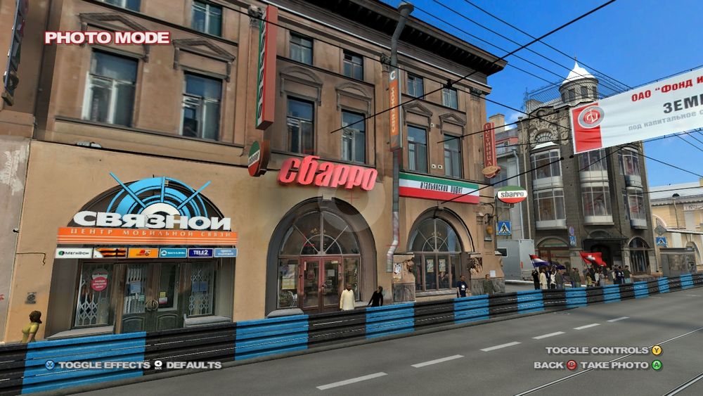


Played a bit of PGR4 and it has the most impressive recreation of a city I've seen to date, a sizeable chunk in a 1:1 scale with every building present and seemingly bespokely textured based on the actual photos of real buildings down to bunch of small signs they made 3D, unbelievable time capsule
It’s especially helpful toward the end of production, when we start adding clusters everywhere. Sometimes the scene was easier to read when there were fewer props.
It also helps spot mistakes and bugs you wouldn’t notice otherwise.
It’s pretty basic advice, but it’s helped me a lot over the years: whenever you’re working on an environment, save your camera coordinates and take regular screenshots.
It makes it much easier to track what has improved, or even sometimes what became worse.

ocean condominium club, atlantic city, new jersey, 1985
ocean condominium club, atlantic city, new jersey, 1985
It’s true that it’s more nuanced in the game. I’ve always felt that one of the most interesting aspects of Mirror's Edge is the contrast between the warm, sunlit atmosphere and the cold dystopian undertones of its setting.
After sleeping on it, I’m starting to prefer the blue version more and more.
I miss the dream-like feeling, I'll see if I can bring it back and make an in-between lighting. Thanks!
I've never been a huge fan of Blacklist though. It's totally fine as a game, but the story was not very interesting to me. I don't like Sam's new voice, and overall the writing felt too much like a modern Mission Impossible movie.
Funny, for Conviction I have the opposite impression. When it came out I hated how different it felt compared to the older titles. But with time, I appreciate more and more their attempt at making something different. It might not be Chaos Theory 2, but it was a good interactive Jason Bourne movie.
It’s true. I´ll try making it more subtle, thanks!

Thank you!
About ME2, I'd say Catalyst has a few districts that somewhat resemble Tokyo and manage to feel fairly grounded. However, other parts of the city definitely lean too heavily into the futuristic side.
Glad you like it!
Thank you!
Yeah, some days I still hope we’ll see a sequel, even if I’m not very optimistic about it. Who knows, some series I thought were dead and buried have managed to make a comeback those last few years.
That's a good point. I agree that the newer version of UE feels more realistic but it is losing a bit of the stylized look.
Although I think Remember Me looks gorgeous too so it's not a bad thing either!
I don't dislike the blue fog in the older version either, but I feel like a proper ME-inspired scene should feel warm, like the sun is constantly flooding the space.


I’m reworking my Mirror’s Edge-inspired scene.
I’ve switched to UE5.7 (right). The lighting and reflections feel more accurate, and the ambient occlusion is improved overall.
I’ve also reduced the strong blue fog and shifted the mood toward a warmer palette.
It is taken from a certain distance (since the factory is obviously restricted) and also I reworked the perspective a little afterward.
