Great to see you there today.
27.10.2025 03:30
👍 5
🔁 0
💬 0
📌 0
Great to see you there today.

A thin, inset blue border type is set in various cap heights in the font Astra Nova, the design of which has each letter comprised of a grid-based matrix of white stars on a dark blue backgorund evoking a nostalgic, Americana aesthetic. Line 1 reads: “NO KINGS” in large blue capital letters. Below that is a decorative horizontal rule comprised of red stripes flanking a blue star. Line 2: “HANDS OFF!” also in blue. Line 3: part one of this message is set in red “UNJUST LAW MEANS WE MUST” and part two is on Line 4: “RESIST” set in blue. Beneath that is a solid red rule.
NO KINGS
Thank you! 🙏
It's an interesting side-effect. Composing specimens with multiple lines in this font gets kinda 🤪
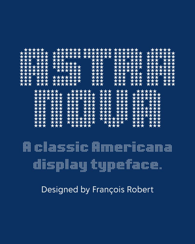
The title “ASTRA NOVA” typeset in all bold capital letters in the font Astra Nova, the design of which has each letter comprised of a grid-based matrix of white stars on a dark blue backgorund evoking a nostalgic, Americana aesthetic. The next line is the subtitle, also set in Astra Nova and in white but amaller and reads: “A classic Americana display typeface.” The last line is set in a sans serif typeface, in white and reads: “Designed by François Robert”
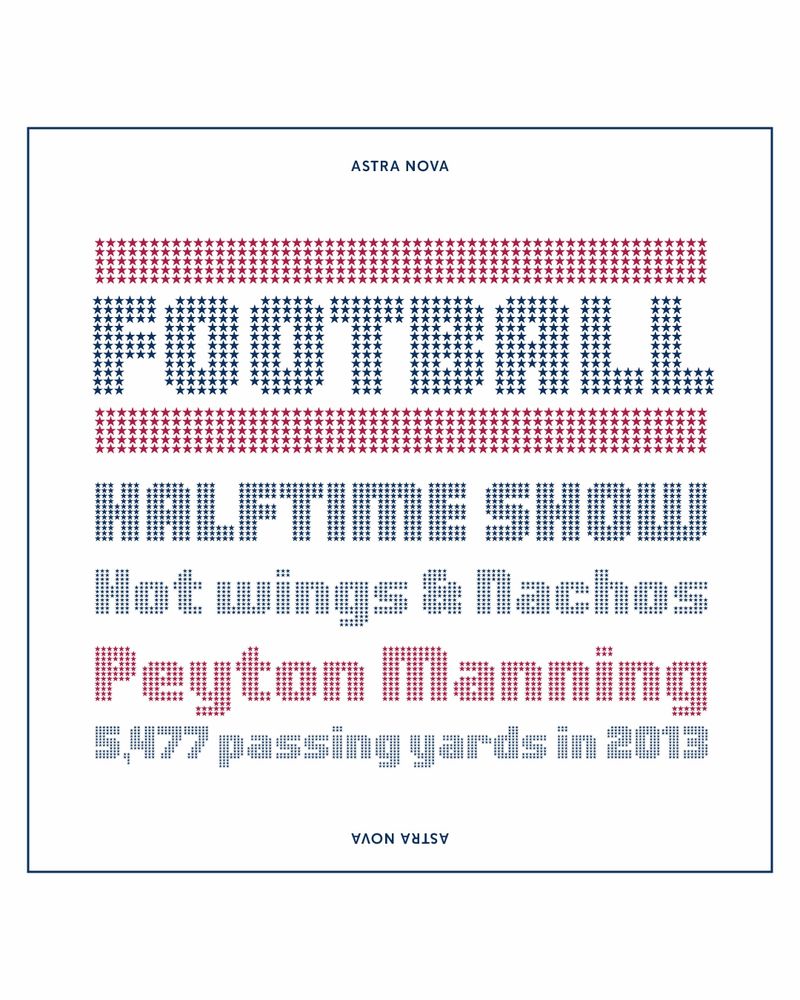
A 5-line type specimen on a white background with a thin, inset blue border and the type is set in various cap heights in the font Astra Nova. Line 1 reads: “FOOTBALL” in large blue capitals, sandwiched between horizontal rules of red stars. Line 2: “HALFTIME SHOW” also in blue. Line 3: “Hot wings & Nachos” in title-case, in blue. Line 4: The name “Peyton Manning” in red. Final line: “5,477 passing yards in 2013”, smaller and in blue.
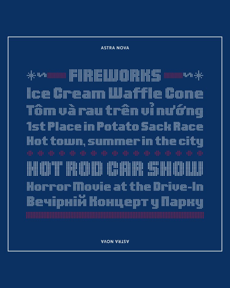
An 8-line type specimen on a dark blue background with a thin, inset white border set in various cap heights and all in the font Astra Nova. Line 1: “FIREWORKS” in white uppercase letters with flanking red and white typographic elements representing firecrackers with lit fuses. Line 2: “Ice Cream Waffle Cone” Line 3: (in Vietnamese) “Tôm và rau trên vỉ nướng”. Line 4: “1st Place in Potato Sack Race,” and Line 5: “Hot town, summer in the city.” A dotted red rule divides lines 5 and 6. Line 6: “HOT ROD CAR SHOW” in white. Line 7: “Horror Movie at the Drive-In” in white. Line 8: (in Ukrainian) “Вечірній концерт у парку” in white. Below that is a bold red rule.
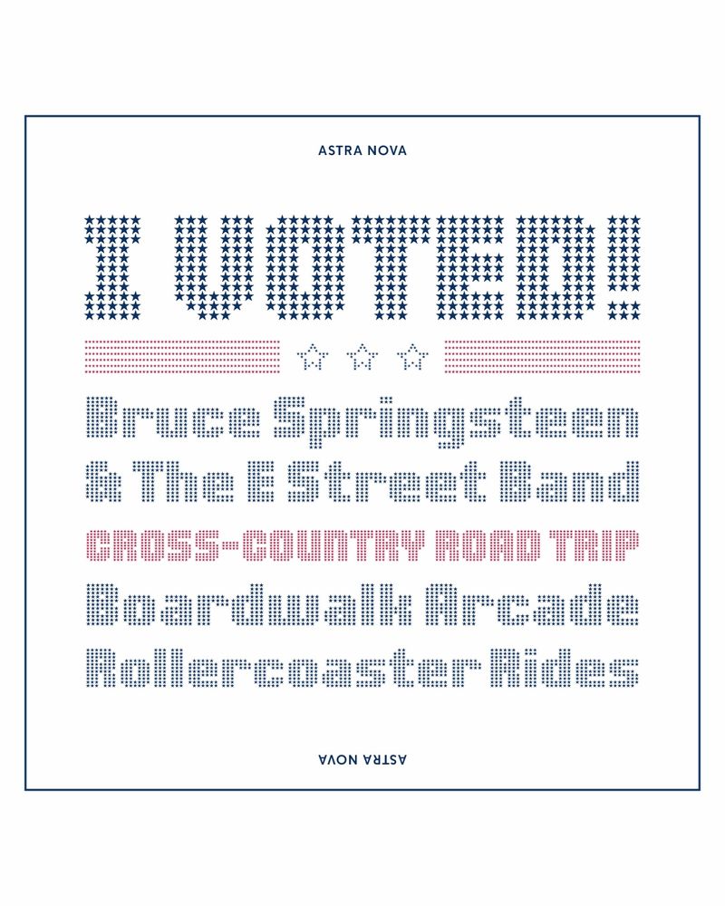
A 6-line type specimen on a white background with a thin, inset blue border set in various cap heights and all in the font Astra Nova. Line 1: “I VOTED!!” in bold blue star-filled uppercase. Below it is a decorative rule of red stripes and outlined stars. Lines 2 & 3: “Bruce Springsteen & The E Street Band” set in blue. Line 4: “CROSS-COUNTRY ROAD TRIP” in all caps, in red. Lines 5 & 6: “Boardwalk Arcade”, and “Rollercoaster Rides” both blue and in title case.
🤩 NEW! Astra Nova by François Robert is a revitalized classic Americana display type he designed in 1969.
This new version precisely reproduces the overlap grid, while expanding the glyph set, and language support.
Add pizzazz to titles, posters, logos, etc.
Buy Astra Nova today 👉 DelveFonts.com

A 4-line type specimen on a bright yellow background with a thin inset blue border and set in the typeface Baudot, the design of which has each glyph comprised of a grid-based matrix of dots creating a digital marquee or signage vibe. Line 1 reads: "BABYLON" – The letters are large, bold, and all uppercase, in the color blue. Line 2: Vietnamese phrase "Nhiệt liệt hoan nghênh" – in all lowercase, also in blue. Line 3: "CASINO" – Same dot structure as “BABYLON” but using blue outlines and red fills. Line 4: "Weekend Matinee" – Smaller text, lighter weight. Overall, the combination of colors and dot matrices gives a festive, retro-futuristic look, reminiscent of old theater signs or arcade displays.

A 6-line type specimen in yellow on a blue background with a thin inset yellow border and typeset in the typeface Baudot. Line 1 reads: "Discotech" - using red outlines and yellow fills. Line 2 is sandwiched between two multicolor horizontal rules and reads: "HIЧHE ШОУ KAЭИHO" Line 3: "Roller Derby Champions" Line 4: "TONIGHT ONLY! LIVE ON STAGE" Line 5: "Frunchroom & prairie view" Line 6: "OMAHA RANCH GRASS FED BEEF"

On a bright yellow background with a thin inset blue border, five lines of the text sample word "Hamburgefontsiv" all in blue but each set in a different style of the typface Baudot with a label indicating the style name and its numeric weight. Line 1: Baudot Bold (700) Line 1: Baudot Light (300) Line 1: Baudot Pop Open (400) Line 1: Baudot Pop Fill (400)

Main Text: "Baudot Pop Open + Fill" written using both layers yellow outline dots and red interior dots to create a colorful effect. Additional Text: “Layer together the two styles of Baudot Pop, Open and Fill for a brilliant chromatic effect.” Decorative Elements: Dotted arrow shapes and sparkles using the same dot grid system, add flair — all on a blue background with a thin inset yellow border.
🔵🟡 Baudot by François Robert was inspired by the bright lights of Vegas to create a display type in 1968 that embodied the glitzy entertainment of that period.
Use it to light up the design of your next logo, poster, website, album, or magazine cover.
Get Baudot 👉 delvefonts.com/fonts/baudot
So that’s how this place just got even better.

A set of five green street signs stacked on a single pole with a bright cyan color background. Each sign has a white border and white text set in the typeface Overpass. The street names displayed are: Rollercoaster Rd, Loadstar Ln, Warwickshire Way, Seasonal St, and Backscratch Blvd

A set of five green street signs stacked on a single pole with a bright cyan color background. Each sign has a white border and white text set in the typeface Overpass. The street names displayed are in all capital letters: ROCKEFELLER RD, LOWLAND LN, WATERCRESS WAY, SUBMARINE ST, and BEDFORDSHIRE BLVD

Two large green street signs on a bright cyan color background with white text set in the typeface Overpass. The top sign reads "Champs-Élysées" Below it, a larger rectangular green sign contains a paragraph of smaller text that reads "An avenue in the 8th arrondissement of Paris, France, 1.9 kilometres (1.2 mi) long and 70 metres (230 ft) wide, running between the Place de la Concorde in the east and the Place Charles de Gaulle in the west, where the Arc de Triomphe is located. It is known for its world-famous theatres, cafés, and luxury shops; as the finish of the Tour de France cycling race; and for its annual Bastille Day military parade. The name is French for the Elysian Fields, the place for dead heroes in Greek mythology."
Overpass by Delve Fonts is free and Open Source. Based on the original US FHWA spec “Standard Alphabets for Traffic Control Devices”, it has 18 styles, 5 Monospace + Variable. Use this versatile family for text, UI, logos, books, and signage.
👉 Get Overpass at DelveFonts.com
Images by Dave Bailey.

Time for a sprint to the finish. With over 80% of the goal already achieved, let’s see if we can get this over the top in the next week. Ready?
www.gofundme.com/f/support-jo...
When I arrived in SF (1996) it was dot-com boom, so:
- Internet / Browser Wars
- iMac / Search sites (Yahoo! billboard) '99 / Y2K
- Nokia / Blackberry
- iPod / Napster
- Smartphones / Apps
…
I'm probably forgetting some.

Uh, yes please. Definitely backing this.
Get in on this Kickstarter @glennf.com has going on now.
www.kickstarter.com/projects/gle...

A large blue silhouette of a skateboarder performing a trick, is overlaid on a dark background. The text is set in the typeface Cortina, arranged in stacked lines, consists of six skateboard trick names: Smith, Feeble, Nose, Salad, Suski, and Crooked. The phrase "SKATE & DESTROY" is at the bottom of the image. Cortina's futuristic, angular style with geometric cutouts and stencil-like characteristics complement the urban skateboarding theme.

The word "GAP" is featured in the three different type styles of the typeface Cortina, each on an angled stripe with alternating background colors of black, white, and blue. The type has a mechanical, stencil-like aesthetic, with geometric and industrial elements.
The unique forms and details of the type family Cortina by Joachim Müller-Lancé demand the viewer’s attention. Put Cortina to work on posters, in games, on packaging, car accessories, book covers, stickers, and more.
Buy Cortina at: delvefonts.com/fonts/cortina
Images by @davebailey.xyz

A stylized typographic composition with a UI reference at the top in shades of gray and blue. The bottom section features two large overlapping capital letter "R"s in the typeface Bodoni 72. One "R" is white, and the other is a dark navy blue. The image conceptually represents the bold formatting function applied to typography, visually contrasting regular and bold weights of the same letterform.
What does “Weight” mean in the design of a typeface?
Read the latest blog post at Delve Fonts “To Boldly Go...” by @johndberry.bsky.social
👉 delvefonts.com/blog/to-bold...
New update. Wouldn’t today be an excellent day to help put my GoFundMe for the history of ATypI over the top? We’re two-thirds of the way there already.
www.gofundme.com/f/support-jo...

An ornate, colorful typographic illustration resembling an illuminated drop cap in a manuscript featuring a capital letter R from the typeface Rieven Uncial.

A type specimen image with light green text set in the typeface Rieven Uncial on a dark green background. The ten lines of copy are: "Majuscule Script, 4th to 8th Centuries, Greek & Latin, Late Rustic Capitals, Book of Kells, De bellis macedonicis, Carolingian Renaissance, Codex Bezae, Petropolitanus Purpureus, Illuminated Manuscript"

A geometric pattern composition divided into four quadrants, each featuring a distinct repeating floral or geometric motif using glyphs from the font Rieven Ornaments. The color palette consists of shades of green, orange, and blue, with alternating dark and light green backgrounds.

A paragraph of dark green text set in the typeface Rieven Uncial on a light green background. The copy reads: "Early uncial script was most likely developed from late rustic capitals. Early forms are characterized by broad single-stroke letters using simple, round forms made possible with the use of the new parchment and vellum surfaces, as opposed to the angular, multi-stroke letters, which are more suited for rougher surfaces, such as papyrus. In the oldest examples of uncial, such as the fragment of De bellis macedonicis in the British Library, from the late 1st-to early 2nd centuries, where all of the letters were not connected to one another and word separation was typically not used. Using space to separate the words, is however characteristic of later uncial usage."
🍀 Steven Skaggs’ innovative Rieven Uncial is packed full of surprises. There is a Roman variant, true italics for both, plus a gorgeous set of ornaments and symbols.
Get Rieven: delvefonts.com/fonts/rieven/
Images by Leila Singleton, Dave Bailey, Delve Withrington
#font #typeface #stpatricksday


Cabazon is an informal, more simplified calligraphic blackletter designed by Jim Parkinson. It retains the warmth of hand-lettered forms and adds some swagger.
Use Cabazon for logos, food and beverage packaging, movie posters, and more for a charming and cool old world feel.
Images by Dave Bailey
Thank you for the kind words about Hexcess. ☺️

Experimental blackletter style text set in pink on a solid black background. The text reads: "Hexcess™ My God, it's full of hexagons! Designed by Delve Withrington"

Experimental blackletter style text set in black on a solid pink background inside a hexagonal outline. The six lines of text are: "Solaris, Under the Skin, The Andromeda Strain, The Man Who Fell to Earth, The Vast of Night, Arrival"

Experimental blackletter style text set in pink on a solid black background inside a pink hexagonal outline. The six lines of text are: "Silo, The Expanse, Tales from the Loop, Love Death and Robots, Black Mirror, Dune"

Experimental blackletter style text set in black on a solid pink background inside a black hexagonal outline. The six lines of text are: "Gwar, Sons of Arrakis, Planetoid, Mastodon, Fear Factory, Black Wülf, Dorga, Gunship, Hoth"
🎸 Hexcess began as a sketch for a sci-fi heavy metal band logo. Hexagons are used to construct a high-contrast condensed blackletter. Obviously readability wasn’t a high priority. Use it big on posters, book and album covers, and legal fine print. 🥴
Get Hexcess at: delvefonts.com/fonts/hexcess/

Who preserves culture—and who cashes in on it? My first
@its-nice-that.bsky.social column of the year is on the ethics of the public domain, using the past as a stock library, and who profits when history is up for grabs 📚 www.itsnicethat.com/articles/eli...


💌 Vena Amoris by talented calligrapher and printer Kathryn Podorsky is a formal script that sparkles in print, and is powered by OpenType for fantastic typesetting right out of the box. Use it for announcements, invitations, certificates, and more.
Get Vena Amoris at delvefonts.com/fonts/vena-a...


⚾️ Hit a home run with Fleisch Wolf & Wurst by Joachim Müller-Lancé. The shapes of the basic alphabet in this contemporary modular blackletter are romanized for better legibility. Use Fleisch for headlines, subheads, and drop caps.
Get Fleisch at DelveFonts.com
Images by Dave Bailey


👁️ The rounded slab serif typeface Maxular by Steven Skaggs is great for text or any setting where a “typewriter” style is desired. The Rx versions are free for personal use.
Get Maxular at DelveFonts: delvefonts.com/fonts/maxular
Images by visionary @davebailey.xyz
👋 Hiya!
Congratulations y’all! 🎉 I believe this exactly what I need. Sign up ✅
It is likely I’m just not remembering how often I was participating in discussions on Typophile.
Infrequently, but yes.
😆

ICYMI - A fun 55:16 long interview by Mina Kim with Simon Garfield about his new book “Comic Sans: The Biography of a Typeface” - www.kqed.org/forum/201010...

Fish & Richardson Dear Delve Fonts, My name is Brandon Avers, and I am an attorney at Fish & Richardson, representing The Walt Disney. I am writing this letter to urgently request that you review the content of the images and videos posted on your platform, as there are concerns regarding potential copyright violations related to our company. Below is the detailed information regarding the copyright infringement: Infringement Information: Page Name: REDACTED Facebook ID: REDACTED Infringing Content: Images and audio in video Copyright Owner: The Walt Disney Attached to this notice, we have included a PDF containing the videos and music that you have used without permission: Evidence Related to Intellectual Property Rights Violation.pdf In accordance with copyright regulations and related terms, we request that you immediately remove the infringing content and cease uploading similar content. Please ensure that the content is removed within 48 hours of receiving this notice. Should the necessary actions not be taken, we will be forced to consider appropriate legal measures to protect the legitimate rights of our company. If you do not take the required actions, we will proceed with legal measures without further notice to protect our company's interests as provided by law. You will be fully liable for any legal responsibility and will be required to compensate for any damages arising from this infringement. We sincerely appreciate your cooperation and understanding. Sincerely. Fish & Richardson, Attorney, Brandon Avers On behalf of The Walt Disney
PSA: Watch out for IP infringement scams. Stay vigilant folks and don’t click these links or fall for this BS. This one landed in my inbox just this AM. 🧐
😍 Super creative and great variety!