Nope.
06.02.2026 21:23
👍 1
🔁 0
💬 0
📌 0
Nope.
No just vector art.


Changed up my laptop skin for the new year. Went with a plain matte white dbrand skin so I can add my own stickers.

Photo of a sketch of a girl with long hair on my remarkable paper pro move e-ink tablet.
First sketch of 2026.
It better be. 🙂
*Tap Tap*
Anyone in here? It's been awhile since I posted. The new year is around the corner and we as a company are trying to get back to what feels like normal. I hope 2026 is going to be a great year. I'm going to work/fight hard for it. 👊
PS. I miss the old (pre-algorithm) days of Twitter.
I now have an LLC:
radiantmars.com

Wrote a detailed post on how to make your own vinyl stickers:
markjardine.com/blog/make-yo...

X100vi.
Made in Affinity Designer.
#design #illustration
Based on your avatar, I can see you have an exquisite taste in yellows too! 😁


And WIP on my virtual shop icon.

I have a new website.
markjardine.com (Still a big WIP and there are some issues in some browsers, but it's up!)

Screen printed a new shirt design. Used plastisol and a 3 color design for the first time (2 colors on this white shirt since I didn't have to print the white). I prefer the look and feel of water-based paints, but this stuff is great when I want really bold colors or need to screen multiple colors.


Had an idea of turning my logo into a kitsune mask, but just wasn't quite happy with how it was ending up when sticking with too many constraints. I really like the end result (second image) even though I had to stray further from my original concept. Going to use this for some fun things!


Some of my latest hats. I love the details I was able to get in the patches in the 3rd photo, but I made the patches slightly too large for my taste so I didn't end up using them. I'll have to make them again at some point, but slightly smaller.
How does video look over here? Me working on my 180s on the 1/4. I think I’ll have the courage to go past the coping sometime this year. 🤔
Thanks Andy!

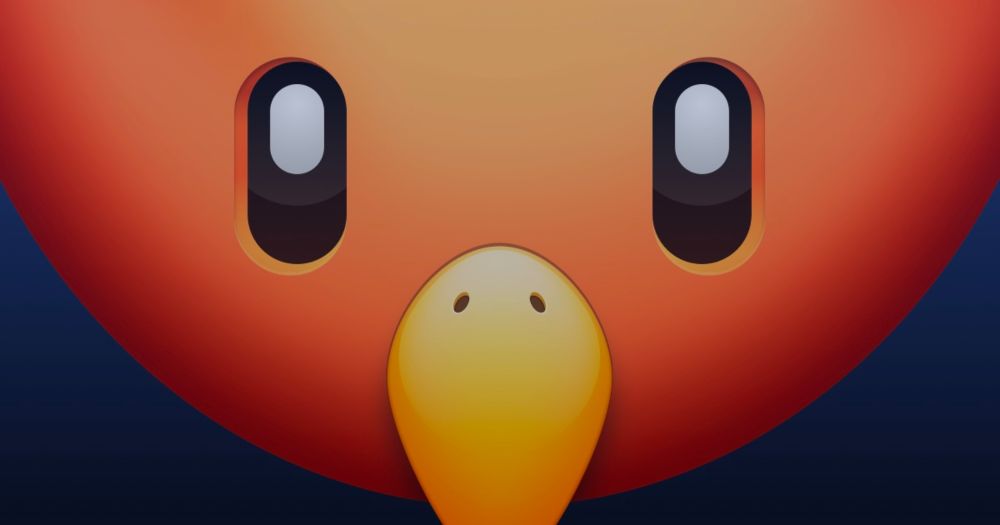
Screenshot of the Phoenix app icon in its current state.
Feeling pretty good about it at this stage.
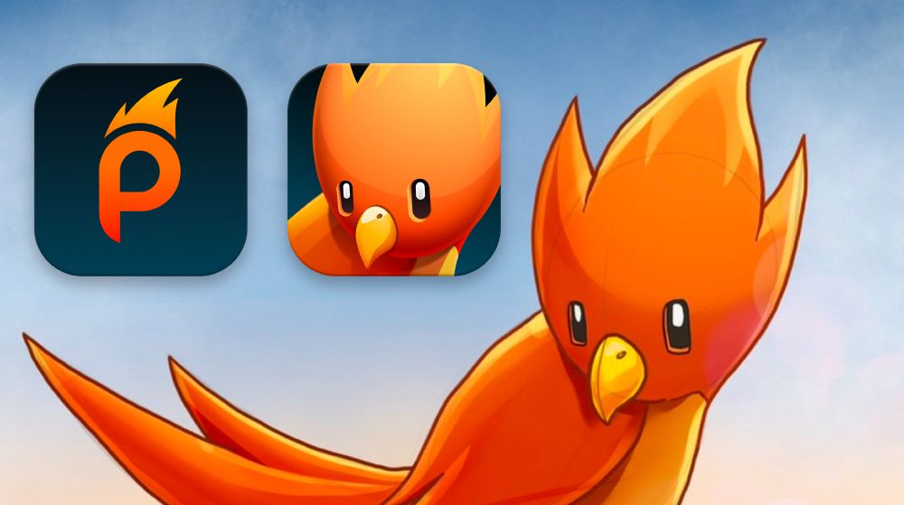
Screenshot of some work in progress icons for Phoenix. There's an icon with the "P" from the Phoenix logo and a psuedo 3D icon of the bird based on the original illustration I did.
I try not to share app icons until later, but I wanted to show where I'm at. The bird needs more refining and I plan to do at least one more flatter style icon. There "should" be 3 style icons to choose from at launch with a few color variations. App icons are not a strength of mine. 😅
So far so good!
Many reasons! Bluesky feels like what Twitter was before suits took over (and the main goal became to monetize), birds still belong in the "Blue Sky", and we thought our app returning as a Phoenix would be a great homage to Tweetbot, but this time with some fire. Also, I don't want a butterfly icon.

Drawing of Phoenix for Bluesky in Procreate. Red/orange bird with fiery shaped feathers standing on a rock.
One of the procreate sketches I did while trying to brainstorm how the "reincarnation" of Tweetbot would look like in the form of a phoenix. Wanted the shape of his head to somewhat resemble the "P" in the Phoenix logo. Not looking forward to doing a proper model/rendering in Cinema4D. 😅