
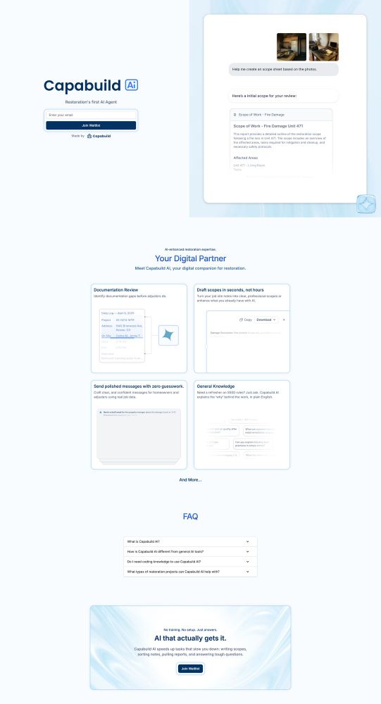
I promise i design more than ai related things, just wanted to share
I promise i design more than ai related things, just wanted to share
18.05.2025 17:00
👍 1
🔁 0
💬 0
📌 0
I promise i design more than ai related things, just wanted to share
I promise i design more than ai related things, just wanted to share

One, two, three or four?
One, two, three or four?

Ai logos exploration part four

Ai logos exploration part four

Ai logos exploration part four

Ai logos exploration part four
Ai logos exploration part four
MVPs don't need to be ugly

AI logo exploration part three
AI logo exploration part three
One hard reality about building products that you won't learn until you start building stuff is that the design process is never linear.
you think you’ll go from a to b, but it’s more like A to G back to C, then maybe scrap everything and start over.
Most product teams don’t need more features.
They need better prioritization and clearer UX.
More buttons ≠ more value.

ai logo explorations part two

ai logo explorations part two

ai logo explorations part two

ai logo explorations part two
ai logo explorations part two

Everyone's been dropping work on dreamy backdrops so I had to try it. Did I cook?

Everyone's been dropping work on dreamy backdrops so I had to try it. Did I cook?

Everyone's been dropping work on dreamy backdrops so I had to try it. Did I cook?

Everyone's been dropping work on dreamy backdrops so I had to try it. Did I cook?
Everyone's been dropping work on dreamy backdrops so I had to try it. Did I cook?
Great UX = empathy + clarity.
Design like someone’s confused, distracted, and on 5% battery.
Assume challenging conditions while trusting your users' intelligence. Stay humble about your design, listen, test and ship.
5. Poor contrast
Design should work before color.
Text needs to be readable for everyone, not just people with 20/20 vision.
4. Walls of text
No one reads long blocks.
Break
content
into
chunks.
Use headers, bullets, and spacing for scannability.
3. Hidden key actions on mobile
Navigation shouldn’t require detective work. If a feature gives you money or show be accesible in just few clicks.
Test everything on small screens. Touch targets should be at least 44x44px. 32 x 32 px if you are pushing it.
2. Vague CTAs
“Submit” and “Click here” aren’t helpful.
Clear CTAs increase conversion.
“Start free trial” → “Click here” (for what?)
1. No visual hierarchy
Users don’t know where to look. Use font weights, spacing, and contrast to guide attention intentionally.
Become best friends with white space and don’t let everything scream.
UX mistakes can kill great products.
Here are 5 I see all the time — and how to fix them 🧵
Playing with small interactions
Finally added more substance to my portfolio #design

Which one is better?

Cooking up some concepts
Stop calling it user error when it's clearly a design fail.
Every time users 'get it wrong,' they're actually showing you where your assumptions about their behavior didn't match reality.
Building better products starts with owning these gaps instead of blaming your users.

Peek a the new signage at Powell bart station
Look, I'm tired of just designing apps in Figma. I’ll learn some Swift so I can build the actual thing myself. My first app's gonna be a hot mess but hey, we all start somewhere 🤷♀️
#Swift devs where do you recommend me start and what kind of app should I build?
Big tech doesn’t feel like the dream anymore.
Now you are better off building your own thing, and trying to monetize from it.

Me: Hey ChatGPT, destroy my design career confidence real quick
ChatGPT: Actually you're a Senior Designer who needs to stop doubting yourself
Me: This feels like emotional damage in reverse 🥲
Are Figma variables worth the hassle for prototyping? 🤔 Creating separate screens feels clearer than wrestling with complex variable setups. Maybe I'm just doing it wrong, but the cognitive overhead seems higher than the payoff. Designers, what's your experience?

I'm that person who uses wappalyzer.com to snoop on every cool website I visit just to see what they're built with 👀
Unwritten rule of UX: Every extra click needs to prove its worth.
Duolingo nails this: Extra click on wrong answer = Teaching moment + Muscle memory
When have you added friction on purpose? 🤔
I feel you. The issue is when the designs never get out of that draft state 🫠
Remember: Every great design started as a terrible first draft

