A stacked bar chart and the corresponding structured alt-text:
Horizontal bar chart. Title: Career choice follows old role patterns. Subtitle: Shares of women and men in various occupations in 2022, in percent. Horizontal axis: 0 to 100 percent. Vertical axis: Nursing and midwifery (vocational education and training), Electricity and energy (vocational education and training), Social work (students at universities of applied sciences), Engineering and IT (students at universities of applied sciences), Human medicine (students at traditional universities), Mechanical and electrical engineering (students at traditional universities). One bar per occupation, divided into two segments: Women (purple), Men (green).
In most occupational fields, a gender-specific distribution is evident.
How to properly AI-generate alt-texts for charts
A simple screenshot prompt produces texts that are too long and unstructured. By interviewing blind readers, Alessia Vannini and Julia Locher found a form that works much better.
Report and examples: github.com/a-vannini/Al...
05.03.2026 13:03
👍 1
🔁 0
💬 0
📌 0
A rough 3D reconstruction of «Le Constellation» in Crans-Montana.
Using publicly available photos, videos and plans @simonhuwiler.ch, Forrest Rogers and I reconstructed the bar’s layout and approximate dimensions.
www.nzz.ch/visuals/aktu...
03.01.2026 09:50
👍 6
🔁 1
💬 1
📌 0

Map of water availability and water stress in South America. The map uses a bivariate color palette with dark blue indicating high water availability and demand, light blue/cyan indicating high water availability and low demand, gray showing low water availability and demand, and orange indicating low water availability with high water demand. Most of the Amazon is low water stress. Atlantic Brazil, the west coast bordering the Andes, and the pampas region have the most water stress.

Map of water availability and water demand in North America. The map uses a bivariate color palette with dark blue indicating high water availability and demand, light blue/cyan indicating high water availability and low demand, gray showing low water availability and demand, and orange indicating low water availability with high water demand. Most of the Amazon is low water stress. Mexico and the U.S. northern plains and southwest have the most water stress. The Pacific Northwest, Great Lakes region, and northeast/Atlantic regions have high demand and availability. Alaska and northern Canada have high availability and low demand, except for the Alaskan North slope with lower availability and higher demand.
Brilliant choice of bivariate color palette in this map of water stress from @wriclimate.bsky.social & ESRI.
I love how it draws attention to areas with high demand for water with saturated colors, & distinguishes low & high availability with a striking change in hue.
via @dantoearth.bsky.social
15.12.2025 16:16
👍 42
🔁 16
💬 0
📌 0

A ridgeline or joyplot showing the biggest parties in the Swiss National Council. The y-axis show the years sind 2004. The x-axis shows positioning from right to left. The curves indicate how members of different parties have voted.
How the Swiss National Council has shifted over time: Analyzing every vote since 2004 shows that party differences have become more distinct, with fewer overlaps than in earlier years. www.nzz.ch/visuals/parl...
03.12.2025 13:31
👍 1
🔁 0
💬 0
📌 0
Maybe it will be in a few years – but for now it has been just another set of tools. So, "use AI" would feel like telling people to use Figma instead of Photoshop to design interactives.
29.08.2025 08:18
👍 1
🔁 0
💬 0
📌 0
Why Visual Journalism is so slow?
I've tracked every hour I worked on an article for two weeks last year. Most of my time did not go into graphics production but in researching and analyzing data.
The detailed breakdown and some ideas how to speed up the process: nightingaledvs.com/why-visual-j...
28.08.2025 10:05
👍 13
🔁 3
💬 0
📌 0
"Recognizing these historical parallels can point to potential future developments […] we can comment on something that statistical graphics can learn from comics, which is how to add some structure to the viewing experience." 2/2
15.08.2025 12:38
👍 1
🔁 0
💬 0
📌 0
No, you didn't miss anything. We haven't tested different orders. Would be very interesting to see if it has an influence.
04.07.2025 14:44
👍 1
🔁 0
💬 0
📌 0

Map of the middle east. Showing the axis of resistance and that the Hamas, Hezbollah, and former Syrian Army have been weakened.

Screenshot of an interactive map of the Middle East.
The balance of power in the Middle East has been shifting for some time. Iran’s allies are eroding, but its former rival Saudi Arabia is warming relations.
Explore our updated interactive map: www.nzz.ch/english/inte...
20.06.2025 15:17
👍 1
🔁 0
💬 0
📌 0
2 Millionen Kubikmeter Gestein sind bereits bei Blatten abgebrochen, weitere 2 bis 4 Millionen Kubikmeter instabiles Material befinden sich noch am Berg. Wie gehts weiter? Die Szenarien von @jonasoesch.ch, @rolandshaw.bsky.social und Jan Ludwig.
www.nzz.ch/visuals/die-...
@nzz.ch
22.05.2025 06:34
👍 12
🔁 4
💬 0
📌 1

A map of Greenland, showing ice coverage and glacier movement speed in meters per year. Made by Perrin Remonté.

Four bar charts combined with a map each, showing common migration routes to the EU and how many people have been taking them since 2017. Published by Die Zeit.

A choropleth map of the U.S., showing areas with risk of climate-related hazards and public anxiety about climate change, among other things. For example, counties near coasts show a correlation between high anxiety and high exposure. Published by maps.com.

Several world maps with different projections and layouts, from a study on designs for readers using mobile devices by Neue Zürcher Zeitung.
🗺️ If you’re a map enthusiast, be sure to read this week’s Data Vis Dispatch! You’ll also find charts on government spending, measles, and the Arctic. 🐻❄️🧊
www.datawrapper.de/blog/data-vi...
20.05.2025 16:28
👍 14
🔁 7
💬 0
📌 1
Computational Public Space
YouTube video by Dynamicland
Computational Public Space. A talk about a values-driven approach to integrating computation into cities. (40 min)
www.youtube.com/watch?v=PixP...
15.05.2025 17:33
👍 84
🔁 24
💬 2
📌 7
That was one of our favorites too! The split hemispheres/-continents allowed us to show the continents even slightly larger – so we went with them.
19.05.2025 06:32
👍 1
🔁 0
💬 0
📌 0
I can totally relate. We took pretty long to come up with the split-hemispheres. In hindsight it is so obvious 😅
16.05.2025 15:59
👍 1
🔁 0
💬 0
📌 0
Ah, these are interesting! What’s the egg-shaped projection called? We explored the two-globe version too (Figure 4), but the split hemispheres/continents were more space-efficient.
www.tandfonline.com/doi/figure/1...
16.05.2025 15:55
👍 0
🔁 0
💬 1
📌 0
Natural Earth + cutting

Projection Buckminster Fuller + rotation

Natural Earth > Atlantis

Two orthographic
Very nice!
A few years back we faced the same problem and tried different solutions.
From using a different projection to cutting the map and even rotating it.
espace-mondial-atlas.sciencespo.fr/en/topic-res...
28.04.2025 09:39
👍 7
🔁 1
💬 0
📌 1

A trick for fitting world maps on phones:
Stack two azimuthal equal-area projections, clipped at 90° longitude, each one rotated 180° from the other.
The bottom map covers the top's Antarctica, which reduces the total height and looks nice.
As seen in www.nytimes.com/2025/04/25/c...
27.04.2025 01:23
👍 84
🔁 15
💬 3
📌 5
We found:
• Splitting and resizing continents makes small countries easier to spot – and is still readable
• Bubble maps are more accurate – but people really don’t like them 2/3
14.05.2025 09:38
👍 10
🔁 0
💬 1
📌 0
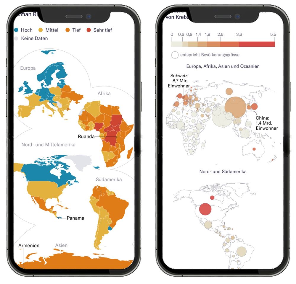
Two smartphones displaying alternative thematic world maps.
The left screen shows a split-continent map with countries grouped and resized by region (e.g., Europe, Africa, Asia) using color to indicate data levels (legend: Hoch, Mittel, Tief, Sehr tief). Smaller countries like Rwanda and Panama are clearly labeled and more visible due to the rearranged layout.
The right screen displays a bubble map, where countries are represented by circles scaled to population size and shaded by data intensity. Larger countries like China and the U.S. have prominent bubbles, while smaller countries remain visible. Labels indicate population figures for Switzerland and China.
Better world maps for mobile!
Despite years of mobile-first design, there’s been little experimentation in this area. So we designed our own at NZZ – and validated it in a large user study.
Summary of the paper: jonasoesch.ch/articles/the... 1/3
14.05.2025 09:38
👍 124
🔁 35
💬 5
📌 6
What if the U.S. adjusted its tariffs on Germany and Switzerland to match what those countries charge?
This NZZ chart by @florianseliger.bsky.social &
@jonasoesch.ch shows how U.S. tariffs would rise under 3 "reciprocity" scenarios using my data from the Global Tariff Database
👇
31.03.2025 19:30
👍 3
🔁 1
💬 1
📌 0
Now that we have vibe coding, we need vibe testing!
24.03.2025 19:45
👍 22
🔁 4
💬 6
📌 0
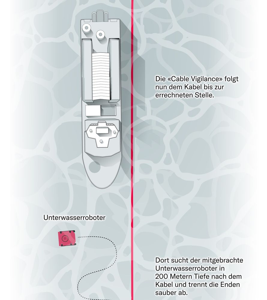
Infographic with a cable ship from above

Map showing the route of a Russian ship through the baltic sea and where it passed subsea cables.
In recent months, Internet cables in the Baltic Sea have been damaged multiple times — Russian sabotage is suspected. But how does that work?
Together with @cianjochem.bsky.social & @lukasmaeder.bsky.social , we visualized one case (inspired by Reuters 🤩)
www.nzz.ch/ld.1875983
21.03.2025 15:37
👍 5
🔁 2
💬 1
📌 0

Nice and clean - relatively low rent?
Adjectives used to describe houses and apartments
in the San Francisco Bay Area in the titles of rental posts on Craigslist and how they are related to rental prices. Titles from 198,279 rental posts on Craigslist between 2000 and 2018. The 15 most frequent adjectives are shown.
Adjectives associated with prices below grand median: nice, clean, special.
Adjectives associated with prices above grand median: beautiful, single, gorgeous, furnished.
🏠 Nice & clean → relatively low rent?
🏡 Gorgeous & beautiful → really expensive?
Which adjectives in Craigslist rental posts for SF Bay Area go with which prices?
#TidyTuesday | 2022 week 27
07.09.2023 18:53
👍 38
🔁 9
💬 1
📌 0
Do you want to animate a @vega-vis.bsky.social vega-lite or @observablehq.com Plot chart? Here is a quick experiment that might help you that animates between two SVGs.
Let me know what you think! #dataviz.
👉🏼 observablehq.com/@john-guerra...
26.02.2025 18:45
👍 23
🔁 7
💬 1
📌 0