Visual Artist at The Guardian UK
Graphics and data at the Washington Post, yarn and dogs at home. Sometimes also dogs at WaPo.
@washingtonpost.com data reporter👩🏻💻
neuroscience/genomics PhD 🧠
caitlin.gilbert@washpost.com ✉️
caitlingilbert.24 on signal
@caitlingilbertdata on tiktok/ig
🎭⚽️🎮 + other intrusive thoughts
https://www.washingtonpost.com/people/caitlin-gilbert/
A community of journalists and others in the media. We meet monthly to learn and share ✨ technical skills ✨ for use in our reporting.
Math, hockey, viz, apocrypha
https://www.not-ship.com/
Explaining the world through data and design • Newsletter: Not-Ship • Formerly Washington Post, Quartz, the Guardian 🇨🇦 🏴
Passionné de visualisations de données, de cartographies interactives et animées, d'animations basées sur les données.
visualdataflow.com
Graphic assignment editor: @postgraphics.bsky.social
Freelance science illustrator: emilymeng.com
Past graphics: @seattletimes.com, National Geographic
graphics director @propublica
🗺🇳🇿🇨🇦🏔 NZ-based cartographer, actually now Canada-based. Blender, QGIS, ArcGIS Pro, Illustrator. Partial to a good mountain.
southarrowmaps.co.nz
🐙 DataViz at @octopus.energy
⚡️ Obsessed with maps and energy
✨ Creator of ViziCities
👨💻 Previously Wood Mackenzie & devrel at Mozilla
GIS and cartography @EU_eurostat (previously @ignfrance.bsky.social), geographical information, maps, orienteering, bike, nature, Europe, Luxembourg, Marseille, Haut-Doubs
https://jgaffuri.github.io/
Data Visualization | ex @PostGraphics @WSJ @SenseableCity
https://www.youjin.info/
Graphics at The Washington Post
https://www.washingtonpost.com/people/luis-melgar/
https://www.lmelgar.me
Graphics Journalist at Reuters Graphics (https://www.reuters.com/graphics/)
| Science Illustrator |
Formally doing infographics and dataviz at National Geographic
Side project: taiwandatastories.com
Made in Taiwan🇹🇼 legal Kiwi🇳🇿
A designer who codes and illustrates in 3D at The Washington Post / ex Guardian
https://www.tobefrank.co.uk/
Senior Editor, Washington Post International Desk
Mapping the world with Python. Geospatial data scientist who likes maps.
Contact adam@pythonmaps.com
Narrativas visuales / Motiongraphics / Infographics /
@lavanguardia.com
http://instagram.com/coniscographics / Astur-Cantabro y Racinguista
Periodista visual y montaraz que se especializa en innovación y formatos narrativos en Colpisa, la redacción central de los diarios Vocento
https://saraibelled.github.io/porfolio/
Graphics, visualizations, maps and more from The Washington Post.
formerly climate graphics reporter & columnist at the washington post
Climate and graphics at @nytimes.com
Email me and check my work: harry.stevens@nytimes.com
Senior Visual Data Journalist at @zeit.de. Co-founder and former CTO of @datawrapper.de. Former @nytimes.com graphics editor #datajournalism #graphics #maps #cartography #dataviz (he/him)
developer / reporter / map maker at ProPublica • dm me on signal: ashaw.01 • also at: @a_l@mastodon.social • he/him
🔗 https://shaw.al
Senior graphics reporter at the Washington Post
Senior editor @propublica.org.
Former Washington Post deputy health & science editor and race & economy reporter. Former Boston Globe national political reporter.
https://www.propublica.org/people/tracy-jan
Journalist/technologist, @financialtimes.com Visual Investigations
📍London
✉️ peter.andringa@ft.com
🔏 Signal: @peterandringa.01
ft.com/news-tips
Design 🎨 & graphics 📊 at the Washington Post
I make charts at the NYT. Sometimes they're good...
https://www.nytimes.com/by/lazaro-gamio
https://lazarogamio.com/
ProPublica deputy news apps editor
data utility developer @sfchronicle.com
Former graphics reporter at The Washington Post. Old runner, new pickleballer. Always up to something.
creative coder, basketball data nerd, preferrer of democracy
also into coffee shops, sad folk music, basketball, and playing chess poorly
data viz: http://perthirtysix.com
creative coding: http://shrikhalpada.dev/projects
Dataviz designer & journalist at the Financial Times
Before: BBC News, UCB Biopharma, MIT Senseable City Lab | Northeastern alumni with Becarios Fundación La Caixa | In the past, 🇪🇸 in 🇺🇸 🇬🇧 🇩🇪
Website: https://irenedelatorrearenas.com
GIS and Cartography at Eurostat.
Exploring new ways of making maps.
observablehq.com/@joewdavies
Data art since 2010, collecting data since I was 4yo. Poetic Web. Data and generative artist turning sound and music into visuals. Lecturer, TEDx speaker, tizianaalocci.com | London based | IG: tiz.alocci | Founder of dataviz studio https://necessity.ink/
Digital humanities, data science, AI, eating, professor of Data & Decision Science and English. Coauthor #DataFeminism w/ @kanarinka. PI #AIAInetwork. Views my own.
Writing about tech, power, data visualization, social media, disability. Assistant prof of computational media @ MIT. 🇹🇼
crystaljjlee.com
Designer, journalist, and professor.
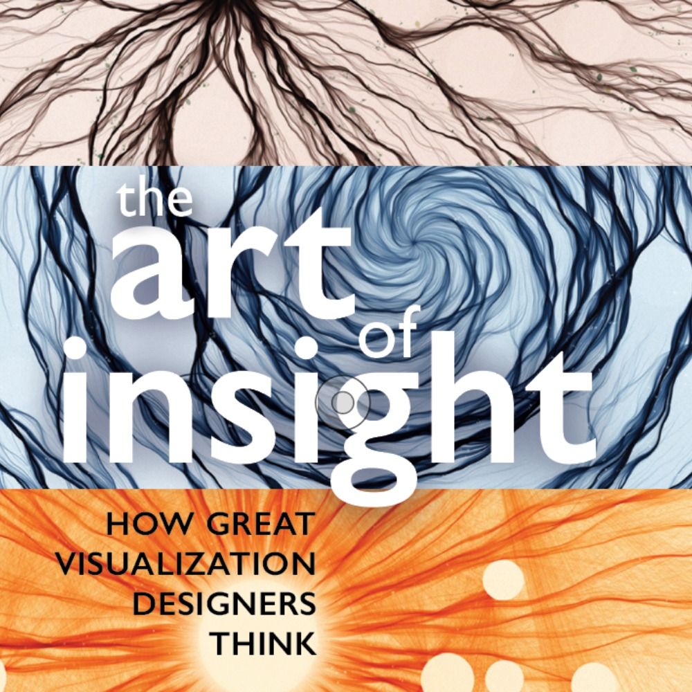
Author of 'The Art of Insight' (2023) 'How Charts Lie' (2019), 'The Truthful Art' (2016), and 'The Functional Art' (2012). NEW PROJECT: https://openvisualizationacademy.org/
Axios managing editor for data viz, previously at Pew Research
My favorite things are quilts, birds, books and maps
🧙♂️✨📊
Independent Data Visualization Designer, Consultant & Instructor | available for projects and workshops
All things data & design with #rstats, #ggplot2, #Figma, #DataWrapper, #Flourish, and more
Co-Founder of the #30DayChartChallenge
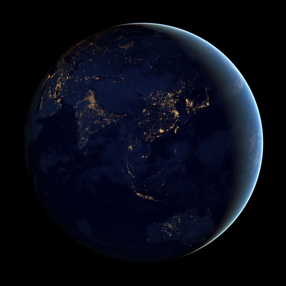
Data Visualization. Ex-Planet & NASA Earth Observatory. Blue Marble, Earth at Night, color, cartography, occasionally skewed views of Earth. Looking for a job.
Creating & writing about data vis for @datawrapper.de
An Independent Data Visualisation Expert educating, inspiring, and celebrating data viz excellence, everywhere since 2010.
🇬🇧 in 🇮🇪
It’s all here http://visualisingdata.com/
Human/AI interaction. ML interpretability. Visualization as design, science, art. Professor at Harvard, and part-time at Google DeepMind.
Visualisation and graphics @posit.co
Classic Generative Art Weirdo using 🖤 and R: http://thomaslinpedersen.art and http://deca.art/thomasp85
he/him
Data and visual journalist, New York Times climate team
https://www.nytimes.com/by/mira-rojanasakul
Crafting data experiences at http://truth-and-beauty.net
Hacker Mama/Artist/Designer/Coder/Writer/She/Ella Assoc Prof of Urban Science @MITdusp, Director, Data + Feminism Lab, Co-author #DataFeminism, hablo castellano
| Husband & dad^3
| head data & visualizations at @spiegel.de
| #Svelte and #D3
| biochemistry & computational biology PhD
| 🇸🇪🇩🇪🇪🇺
| https://spiegel.de/duv
| https://higsch.com
Award winning Frameshift Designer @ TULP interactive
https://tulpinteractive.com https://timebender.io
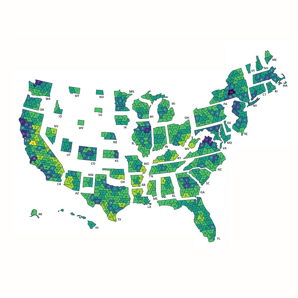
Contributor @the-downballot.com. Focusing on data, maps, and demographics. Find our data (and the CD hexmap template!) at https://the-db.co/data
Infographisme @LePoint, passée par Libé, Le Monde et WeDoData // Une des moitiés de GoumProd // J’aime beaucoup les cartes
-Mapping the world- Dr. in Physical Geography | environmental health - bioclimatology - geography. RC Researcher from 🇩🇪 at @mbgcsic.bsky.social @csic.es in 🇪🇸 #rstats #dataviz
Secretary of the @aeclim.org
📍Galicia
ℹ️ https://dominicroye.github.io
Creative Technologist | Data Visualization Designer & Developer | Researcher.
Building websites at nussknagger.com
Always learning something new. (he/him)
https://sebastianlammers.com/
Powerpoint by day, #ggplot2 by night. Here for dataviz and #rstats content and rants about football. 📊⚽️
Based in Cologne, Germany.
Presently PhD candidate studying tool-making for vis 📊 @hcii.cmu.edu. Prev: Adobe, Highsoft, Apple, Visa. Fall 2026: assistant prof @ Cal Poly.
Softer-ware (malleability), accessibility, data interaction.
Disabled & making a ttrpg.
www.frank.computer
Graphics editor at Scientific American. Medical illustrator-turned-datavizzer, New Yorker, parent. She/her. These views are mine, get your own. https://amandamontanez.com/
I design and develop interfaces for technical domains. Past lives in arch/history of arch. Generally interested in: ∩ of data/image/language; history of most things; frontend dev/web/TS; learning; dad jokes. Camberville, MA
Cartography is my passion & profession. Author of CARTOGRAPHY. & THEMATIC MAPPING. Maps+drums+beer+snowboards+footy+politics+sarcasm. 🇬🇧 in 🇺🇸 Views mine. links.esri.com/mappyhour
Data visualization consultant at the Development Data Group of the World Bank
www.maartenlambrechts.com
https://openclimatedata.net/
generative artist and prof, data visualization developer, identity-challenged
dataviz: https://do.minik.us
art: https://dominikus.art
Americas editor, @graphics.reuters.com. Once: FiveThirtyEight, CUNY adjunct. Almost Canadian.
Professor of Visual Analytics who does datavis, visualization storytelling and natural travel. Did I mention visualization?
Interested in all things visual and data, like data visualization. ISOTYPE collector, synth dabbler, runner.
chinese-american artist, software engineer, dataviz designer, keynote speaker, published author && a work-in-progress learning to take up space ✨
🔗 shirleywu.studio
Data & information designer 🍋 Co-founder of the DataSuffragettes 🍋 Creative director of Nightingale, journal of datavizsociety 🍋 bobbaddict
Author: What We Ask Google, May 2026. Data storyteller @Google. Was @Twitter @Guardian. Co-host with Alberto Cairo & Scott Klein of http://datajournalismpodcast.com
Data Visualization Specialist • Author of Chart Spark • Data Literacy Advocate • Host of Data Viz Today podcast
📕 https://chartsparkbook.com
#kakistographs
from Ancient Greek κάκιστος (kákistos, 'worst')
▵ Making your data visualization workflow easier: ladataviz.com
▵ Uncharted Area, a newsletter about building a two-people company in data visualization: newsletter.ladataviz.com
▵ Figma to Tableau Plugin: http://bit.ly/Figma2Tableau
data visualization designer and founder of r42.ca
#dataviz · #LookerStudio · #PowerBI · #d3js · #measure – 🇨🇦 🇩🇪
Data artist and designer
https://www.c82.net
Information designer from Helsinki. Co-founder of Koponen+Hildén
Co-author of the Data visualization handbook / Tieto näkyväksi (Finnish edition)
Founder of http://ShowMyData.org. Board member of http://ManyBrains.net. Graph interpretation research: https://www.sciencefriday.com/segments/bar-graph/. Faculty @Wellesley.
Engineering Fellow at JMP, focused on #DataViz, preferring smoothers over fitted lines. Creator of JMP #GraphBuilder and #PackedBars chart type for high-cardinality Pareto data. #TieDye #LessIsMore
Information Visualisation 📊📉✍🏼 and Climate @ University of Twente
Core projects:
The Languages of Visualization, with Clive Richards
UT Climate Centre @utclimate.bsky.social
LinkedIn: https://linkedin.com/in/yuriengelhardt
Mastodon: https://vis.social/@yuri
Freelance Data Designer
Programs Director @ Data Viz Society
She/they/whatever
programs@datavisualizationsociety-dot-org
BSs in Biology and Applied Physics, PhD in Organismic and Evolutionary Biology
Data/Visual Journalist LeTemps🇨🇭 @letemps.ch | Lecturer #ddj AJM UniNE | #dataviz #rstats #datascience | Formerly Tamedia, Swiss Broadcasting Corporation, Quant, Genetics PhD | He/him
Based in Lausanne, Switzerland
From Singapore 🇸🇬 Head & Co-Founder, Kontinentalist. Data storyteller. Chevening Scholar 23’, MSc Data, Inequality and Society at University of Edinburgh 🏴
Senior data producer, CBC/Radio-Canada. Behind https://github.com/nshiab/simple-data-analysis and https://code-like-a-journalist.com/. More on https://naelshiab.com/.
Editorial data scientist working on computational investigations for the visual and data journalism team at the Financial Times.
🌐 olihawkins.com
Senior editor, data + viz @bloomberg /
formerly @nytclimate
✨✨✨✨✨
graphics/data journalist on the @financialtimes.com visual storytelling team
work: https://www.ft.com/sam-learner
projects: https://samlearner.com/projects
signal: samlearner.79
A bit of everything, recreational math, mechanical engineer, programmer, statistics, dataviz.
Building theschoolofcode.com - an interactive online course platform
Data Editor @nikkei.com @asia.nikkei.com | Newsroom AI Initiatives Lead | The Lede Program @columbiajournalism.bsky.social alum
https://linktr.ee/kazuhirokida
Data Visualization researcher and Professor of Computer Science at the University of San Francisco. Research interests - Visualization Literacy, Mobile Data Visualization. Anti-Racist. Immigrant.
web: https://www.cs.usfca.edu/~apjoshi
VP of Information Design at Nomic building new interfaces to embeddings; former history professor/digital humanist. Bsky for humanities/dataviz-y things, @benmschmidt@sigmoid.social for techy stuff, the bad place for business.
https://benschmidt.org
maps | data | code | journalism
#D3 & #Observable
👁️🗨️ https://observablehq.com/@fil
🌍 https://visionscarto.net/
Data visualization designer
krisztinaszucs.com
We’re an information design and development agency crafting memorable data stories. Rooted in India with a global outlook. 💻 https://revisual.co/ 💻
#dataviz #informationdesign
Data journalist at the FT
🇮🇪 in London
Head of Visual and Data Journalism @financialtimes.com; Honorary Prof @UCL Social Data Institute. Views expressed are my own. Reposts are not necessarily endorsements.
data/dev/design/map enthusiast
I run diagramchasing.fun.
Bangalore, India
#dataviz #rstats #svelte #maps
🔗 https://aman.bh