Maps, open data, open source. Formerly @ Mapbox, Development Seed
Wants to retire and sit in the sun listening to metal and reggae drinking beer & wine and learning Old English
Freelance Cartographer at www.eventmaps.co.uk and trustee/council for The BCS @bcsmaps.bsky.social
Cartographer, data visualizer, beans on toast defender.
helenmakesmaps.com for tutorials
Mapping+Excellence+Community
The BCS promotes the art & science of mapmaking and all aspects of cartography to a wide audience.
Winter Lecture 11th Dec
GeoFutures questionnaire during December
GeoFutures 25th March 2026
🌈 Author, broadcaster and lecturer in design, cartography, typography and architecture around public transport. Partner of ND 🌈♾️ person. Pro-Transit 🚆 🚃 🚋 🚟🚌 and ‘in transit’ from X as @markovenden.
Fell in love with the tube map as a youngster in London - love the thrill of designing rail diagrams. https://projectmapping.co.uk
Shop for printed maps at: http://redbubble.com/people/MrMappy…
Consultant | NED | Co-author @locuscharter | Boards - PLACE Trust @thisisPLACE, Association for Geographic Information @geocommunity | Advisory boards @OpenUK @geospatialwomen #Data4Good #EthicalData aka #spatialred https://x.com/SpatialRed
Cartographic Editor of Maps.com & Content Strategy at Esri. Prev: DataViz Lead for NASA’s Earth Observatory. Mostly on X. Dad stuff everywhere else. Views my own.
I make posts about making videos about making maps about stuff.
Husband. Father. Stage 4 metastatic cancer “survivor” (in partial remission).
Was @mappingmashups on Twitter. Now I’m all-in on Mastodon, so go follow me there: https://subdued.social/@alan
Just here to run the socials for @stamen.com and to nag you all to join Mastodon.
Advocate of the #BellinghamWA hashtag
Host of daily podcast The News Agents. And author of Strangeland. Available at all good bookshops….
Editor (and occasional builder) of graphics, maps and visual stories at the Washington Post.
Award-winning mapmaker and illustrator in Valencia, Spain | My first book THE BOROUGHS OF LONDON is now available! https://www.batsfordbooks.com/book/the-boroughs-of-london | More info: linktr.ee/thisismikehall
Senior Product Manager of Mapping & Cartography @ Esri. Previously @washingtonpost.com and National Geographic. Map-maker and geographer. https://linktr.ee/tierneymaps
British Cartographer & Artist living in Huntsville, Alabama.
Map maker & GIS consultant.
Including hand-drawn plausible fictitious maps
https://artimaps.com/
Creative data artist in the spatial industry.
Academic: Professor at RMIT University, GIScience, spatial algorithms, AI, and databases, ontologies http://gkl.rmit.melbourne
Author: GIS 3e http://gisacp.duckham.org
Me: gender equity, wheelchair user, food, new music
exploring the world though interactive maps
Maker of maps. Geography/GIS/Cartography professor. Occasional landscape photographer. Not the English footballer but am available for autographs.
Excited to announce A NEW LIVE TOUR!
The End of The World According to Jonathan Pie
Tickets ON SALE NOW from JonathanPie.com
🗺🇳🇿🇨🇦🏔 NZ-based cartographer, actually now Canada-based. Blender, QGIS, ArcGIS Pro, Illustrator. Partial to a good mountain.
southarrowmaps.co.nz
Data, charts, analysis and games from The New York Times: nytimes.com/upshot
Senior Visual Data Journalist at @zeit.de. Co-founder and former CTO of @datawrapper.de. Former @nytimes.com graphics editor #datajournalism #graphics #maps #cartography #dataviz (he/him)
💼 Co-lead data & visualizations @spiegel.de
🗺️ Blogging about maps at letsmakeamap.com
#dataviz #ddj #maps #rstats
Senior editor, data + viz @bloomberg /
formerly @nytclimate
✨✨✨✨✨
E. Willard and Ruby S. Miller Professor of Geography, Penn State. Director, Online Geospatial Education programs & GeoGraphics Lab. Chair, AAG Cartography & Mapping Specialty Group. Vice Chair, ICA Commission on Geovisualization. Past President of NACIS.
@data.ft.com Senior Visual Journalist. Mad about cartography, dataviz and F1! Check out my QGIS youtube channel at http://bit.ly/1MAR2Po
Follow me on Instagram
@stevendbernard
A Map Evangelist
CartoGuophy.com
I'm here for the maps.
Map projects: https://aaronkoelker.com/
Data visualization designer & data scientist
Co-founder of Jetpack.AI
GIS Faculty, Centre of Geographic Sciences (COGS); Fellow, Royal Canadian Geographical Society; co-Director, Esri Canada Centre of Excellence (COGS). My posts
Just getting started on bluesky
Astronaut photos-of-Earth maps: https://isspix.com/MapTourHowTo
UW Computer Science Professor. Data, visualization & interaction. UW Interactive Data Lab, Vega, Ex-Trifacta. Sometimes Seattle, manchmal Berlin.
Graphics Reporter with The Wall Street Journal
on Lenni-Lenape land
a cobra vai fumar
https://churchillgeo.com/
A celebration of transit maps and diagrams from around the world. Visit the blog at transitmap.net. 🔁 Reposts appreciated!
Transit map prints sold at: transitmap.net/store
Transit mappers starter pack: https://go.bsky.app/32jXV41
cartographer of things
https://andywoodruff.com/
Dataviz blogger, author and Hall of Fame Tableau Visionary. Was @theneilrichards on here and the horrible other place.
Data Fluency @JLL
questionsindataviz.com
https://routledge.pub/Questions-in-Dataviz
Author: What We Ask Google, May 2026. Data storyteller @Google. Was @Twitter @Guardian. Co-host with Alberto Cairo & Scott Klein of http://datajournalismpodcast.com
chinese-american artist, software engineer, dataviz designer, keynote speaker, published author && a work-in-progress learning to take up space ✨
🔗 shirleywu.studio
Graphics Editor at The New York Times 🇺🇸| former Reuters 🇸🇬 | South China Morning Post 🇭🇰 | La Nacion 🇨🇷
Americas editor, @graphics.reuters.com. Once: FiveThirtyEight, CUNY adjunct. Almost Canadian.
JasonForrestAgency.com, Data Vandals, Editor-in-chief of Nightingale, Electronic Musician, Ex-McKinsey. Contact & more: http://jasonforrestftw.com
— Founder of Our World in Data
— Professor at the University of Oxford
Data to understand global problems and research to make progress against them.
Already living in the future of news at Newspack. Board at @muckrock. Former @propublica. Hoping for the best.
i write the data-driven politics newsletter Strength In Numbers: gelliottmorris.com/subscribe
wrote a book by the same name wwnorton.com/books/Strength-in-Numbers
polling averages at @fiftyplusone.news
formerly @ 538 & The Economist. email, don't DM, me
What’s a Map in the Wild? It’s a map in a real-life context, a sign, a poster, an object, perhaps quirky, perhaps unexpected. What it isn’t is a screen grab from a web site, the output from a GIS or similar.
Head of Data and Visualization @zeit (zeit.de/daten-und-visualisierung)
Data Visualization Specialist • Author of Chart Spark • Data Literacy Advocate • Host of Data Viz Today podcast
📕 https://chartsparkbook.com
Geographer + accidental cartographer. Posting about geography, maps & more.
https://geoviews.net/
Professional chart looker-atter. Author of "The Big Picture" and co-author of "The Big Book of Dashboards." James Jamerson disciple.
Head of Visual and Data Journalism @financialtimes.com; Honorary Prof @UCL Social Data Institute. Views expressed are my own. Reposts are not necessarily endorsements.
Head of data journalism at The Economist
Washington Post Opinion Design and visuals Director. Prev National Geographic, Boston Globe and Spain.
If I'm writing in Spanish is probably about fútbol.
European and American.
Portfolio: https://chiquiesteban.me/
Data storytelling + information design expert⚡️Founder of Parabole Studio 📡 www.parabole.studio 👈
Attempted Whimsy. Novel experiences.
I like maps, GIS, data visualization, graphic design, hiking, writing, and hanging out in nature. I wrote a book, GIS for Dummies (2nd Edition).
We are dedicated to fostering community for data visualization professionals.
Cartographer at NatGeo | past Board member @ NACIS
geographer | adventurer | Rhode Islander | she/her
Data visualization consultant at the Development Data Group of the World Bank
www.maartenlambrechts.com
Bikes (MTB, gravel), Travel, Spain, Higher Education, Geospatial Technology, International Development, Mediterranean food/lifestyle. (Don't forget to use your sarcasm filter) --alguna que otra cosa bilingüe
Playing with data, visualizing it for humans at flowingdata.com
Cartography and graphics @postgraphics.bsky.social | Big ol' fan of @wfmu.bsky.social
https://moriartymaps.com/
👋🏻 I'm Kate ᵉᵃᵗᵉʳ ᵒᶠ ᵖᵒᵗᵃᵗᵒᵉˢ ᵃⁿᵈ ᵐᵃᵏᵉʳ ᵒᶠ ᵐᵃᵖˢ
🌐 I make #geospatial & #GIS (more) fun by sharing #mappymeme s & #maptastic themes. #GISchat. ᵛᶦᵉʷˢᵐᶦⁿᵉ
http://linktr.ee/pokateo_maps
explanation graphics; author (latest: let’s get Infografit, 2025); happy to be alive! working on a book about visual language…perhaps ready in 2026
Cartographer, Cyclist, Kayaker
Tableau evangelist + data communicator.
Newsletter: http://tabsoft.co/sweetspot
Book: http://bigbookofdashboards.com
LinkedIn: https://www.linkedin.com/in/acotgreave/
Visual perception and cognition scientist
(he/him)
My site: http://steveharoz.com
R guide: https://r-guide.steveharoz.com
StatCheck Simple: http://statcheck.steveharoz.com
Columnist and chief data reporter the Financial Times | Stories, stats & scatterplots | john.burn-murdoch@ft.com
📝 ft.com/jbm
ASA Fellow; #rstats developer of graphical methods for categorical and multivariate data; #datavis history of data visualization; #historicaldatavis; Milestones project
Web: www.datavis.ca
GitHub: github.com/friendly
Crafting data experiences at http://truth-and-beauty.net
Creating & writing about data vis for @datawrapper.de
Information design and data visualization studio focused on the environment, social development, and governance.
Montreal (since 2013).
English and French
Interactives, dashboards, reports, presentations, training
Posts by Francis Gagnon, founder
Award winning Frameshift Designer @ TULP interactive
https://tulpinteractive.com https://timebender.io
-Mapping the world- Dr. in Physical Geography | environmental health - bioclimatology - geography. RC Researcher from 🇩🇪 at @mbgcsic.bsky.social @csic.es in 🇪🇸 #rstats #dataviz
Secretary of the @aeclim.org
📍Galicia
ℹ️ https://dominicroye.github.io
Data journalist at @data.ft.com. These days mainly thinking about elections data and how to use automation and AI in news. #ddj #dataviz
Assoc Prof Computer Science and Communication Studies at Northwestern. Infovis, HCI. Author of tidybayes & ggdist R pkgs. he/him. 🏳️🌈 https://mjskay.com/
Co-director https://mucollective.northwestern.edu
Co-founder https://journalovi.org
art + code, information + design, slime mold, maps.
data viz at Vera Institute of Justice, opinions my own
Interested in all things visual and data, like data visualization. ISOTYPE collector, synth dabbler, runner.
graphics/data journalist on the @financialtimes.com visual storytelling team
work: https://www.ft.com/sam-learner
projects: https://samlearner.com/projects
signal: samlearner.79
An Independent Data Visualisation Expert educating, inspiring, and celebrating data viz excellence, everywhere since 2010.
🇬🇧 in 🇮🇪
It’s all here http://visualisingdata.com/
@cartonaut elswhere
Map-o-phile / GIS wrangler / M.S. GIS / GISP / mischief / 🗺️ / solvitur ambulando
Award-winning Data Visualization Designer & Data Artist | Founder of Visual Cinnamon | Graduated Astronomer ✨ | Author of "CHART" & "Data Sketches" | 🇳🇱
VisualCinnamon.com
CEO of dataliteracy.com, author of nine books on data and AI including Avoiding Data Pitfalls and AI Literacy Fundamentals
🧙♂️✨📊
Independent Data Visualization Designer, Consultant & Instructor | available for projects and workshops
All things data & design with #rstats, #ggplot2, #Figma, #DataWrapper, #Flourish, and more
Co-Founder of the #30DayChartChallenge
Professor of Visual Analytics who does datavis, visualization storytelling and natural travel. Did I mention visualization?
Putting science on the map at Woodwell Climate Research Center | Cartographer | Analyst | Senior Research Associate | Fly fisher | located in Woods Hole, MA, USA
part beagle and part disaster
Visual journalist and cartographer
Past President, North American Cartographic Information Society
Designer, journalist, and professor.
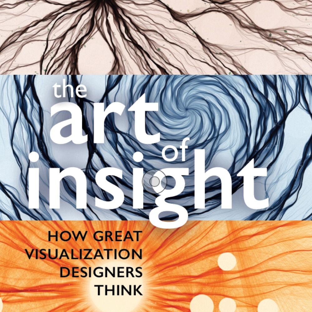
Author of 'The Art of Insight' (2023) 'How Charts Lie' (2019), 'The Truthful Art' (2016), and 'The Functional Art' (2012). NEW PROJECT: https://openvisualizationacademy.org/
The FT’s team of reporters, statisticians, illustrators, cartographers, designers, and developers work with colleagues across our newsrooms, using graphics and data to find, investigate and explain stories.
https://www.ft.com/visual-and-data-journalism
Data Visualization. Ex-Planet & NASA Earth Observatory. Blue Marble, Earth at Night, color, cartography, occasionally skewed views of Earth. Looking for a job.
Cartography • Geo-visualization • Geo-Scientist • Esri
Keynote speaker • Rock climber • ITMF • behance.net/sarahbellmaps